It might be surprising to think that something as simple as a vehicle with two wheels could have so many vastly different styles, but it's true. There are so many different types of motorcycles it belies belief. Especially when these bikes are seen custom made, strangely shaped, incredibly designed or flawlessly fabricated. The stark difference, for example, between a spartan, no frills cafe racer and a luxurious, byzantine chopper is, at times jaw dropping. It's as if they came from two different planets, two different timelines, two alternate realities. It's absolutely amazing, really, and wonderful that people feel the desire to express themselves with such individuality. It's a testament to human creativity and self-expression, even if this person doesn't like that kind of motorcycle, or that person hates this kind of motorcycle. We all have the right to express ourselves, and we should, no matter what that is.
One of the ways people express themselves with their motorcycles isn't by stripping it back, making it look rugged and minimalist, or by fabricating an entirely custom frame with every frill imaginable, or anything like that. It's as simple as how they decide to paint their motorcycle. A lot of people don't have the time or resources to overhaul their motorcycle, so to make the bike just their own they decide to get a custom paint job. Sometimes they look amazing, but sometimes they're just plain crazy. Here's a look at 20 of the craziest custom paint jobs on motorcycles.
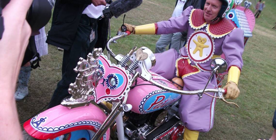
20 Abstract Pastel

Okay, so compared to the last one, this bike doesn't look nearly as terrible. The colors are bright and don't exactly match, but at least they have a certain color scheme they're fitting together with. And there's no creepy card-dealing clown.
That doesn't mean this paint job looks all that good though. The more you look at it, the less it matches, and the less appealing it gets. Add to that the fact that a bike with three storage containers and a windshield can never really truly look good and we've got ourselves a rather homely motorcycle.
19 Classic Leopard Print

Okay, let's clear the air. Just because leopard print is classic, doesn't mean it looks good, ever did look good, or ever will look good. It's just not a very good pattern, especially when it's cartoonized, like this, boiled down to two tones. It just doesn't really work, on anything, let alone an an entire motorcycle.
I think the most worrying thing to me, though, is the seat. That upholstery job is beyond comprehension.
I can't tell if it's just really really cheap or if it's just the fabric choice. Either way, I guess. The effect is the same.
18 Way Too Busy

There's just a little bit too much going on with this tank. It' just too busy, with too many colors and patterns and textures. The very fact there's so many different patterns, colors and themes makes it a dud that doesn't work.
This is one crazy custom motorcycle paint job, for sure and if you can't quite see it or didn't realize, the tank actually says "company" on the blue part of the tank. I can't quite figure out the name of the company, but the top part is made up of letters, too.
17 She's Watching You

A lot of times these custom motorcycle paint jobs are done by professionals who are good at one specific thing: drawing patterns with an airbrush, and creating sometimes amazing art. But, they may be commissioned to do things a bit beyond patterns, they might be asked to paint some kind of figure, or person, or realistic thing.
Often times they're not nearly as good at that as they are at painting designs and patterns. Which is why you have a motorcycle here, besides being a truly unappealing color, has one strange girl, painted very much mediocre, staring out at the world. It's just bad.
16 Here We Go Again With The Leopard Print

Here we go again with the leopard print. This time it's made out of what to me looks like actually fabric of some kind. Clearly it isn't real fur, that would just be outrageous, really. You have to give props to whoever completed this build because the eye for detail is surprisingly meticulous.
Every inch is coated in an even, seamless, smooth layer of fur. Even on the underside, even the tail.
There's also, besides all of that, a perfectly matching helmet poised right there on the bike in camouflage. Leopard print is just not my taste though.
15 Chunky Chrome And Lemon Creme

This is a really massive motorcycle. It has a huge engine, a huge frame, a huge seat, huge fender flares and it makes for an overall massive and imposing looking motorcycle. That is, except for the strange graphics custom painted on this thing.
They are chunky, almost look like they come out of Native America, Art Deco, or some sort of strange hybrid of the two. The color is to me exactly like lemon curd or a meringue pie. It makes for a really strange combo that on some levels works, and on some other levels doesn't work at all.
14 Halloween Space Clown Round Two

Okay, so this custom paint job is much worse than the one we featured at number 20. The color scheme is much more unappealing and odd, the clown is significantly more disturbing, too and it's right on the front of the bike, which, objectively, the bike itself isn't exactly well styled.
The excessive chrome and strange assortment of accessories doesn't make things any better and the cards are back again.
Which means it's the same artist as before, too. Maybe they shouldn't draw clowns, honestly. It's just too much to handle, and it's not quite good enough.
13 Not Fooling Anyone

I don't think this Japanese street bike is fooling anyone into thinking that it's a U.S. military vehicle of any kind. The bike is just not credible that they would even use such a dinky, impractical machine.
I could see them using some sort of motorcycle maybe, but not this kind of motorcycle. Unless, of course, they start acting out Night Vigilante Slick Street Justice En Masse. But I doubt it. Until then, this guy is just going to look like a poser and a copycat. He'll be making people point and scratch their heads everywhere he goes.
12 Strange Seat Shape

Of all the things about this bike to notice, from the appalling dark orange color or the unbalanced overall shape, from the truly clashing and dated pinstriping with blue and yellow and red or the really awkwardly small fender - the thing that stands out to me the most is the truly strange shape of the seat and tail.
The seat does not have any flow, and the tail end looks like some really foreign appendage of some kind, like E.T.'s finger or something.
I imagine it looks very strange from every point of view, not just this one.
11 Flaking Orange Fanta Paint

The crazy custom paint job on this motorcycle is truly something to behold. Not only does this bike have an extended back wheel (very, very extended) which is designed for better stability so as not to pop a wheelie during the fast acceleration common to drag races, it also has one of the loudest paint jobs on this list, interrupted by the most plain of colors, silver.
It ends up making it look like they forgot to paint certain sections, or that the orange color is flaking off. It also makes me strangely crave a Fanta. Don't you want?
10 All Dark Yellow And Black

The unfortunate thing about this paint job is that all the sick webbing, gore, and skull designs aren't actually in gold hue. It's more like a sickly greenish dark yellow. Not the kind of color you want to see on a motorcycle or anywhere else. The wheels are completely coordinated too, which in most circumstances would make it a lot better, but not in this case.
While the graphics to me personally are very silly and borderline disturbing, it's the color that's really unappealing. Because if it was shining, warm, bright gold, things would look a lot better. Maybe
9 Hot Pink Playroom Motorcycle

The paint job on this motorcycle is extremely unique. I'm not sure another motorcycle has been painted like this, and I don't think another one will after, either. The tropical reef at sunset theme is really specific, and very much specialized to someone's very strong and independent tastes. Good for them.
They've managed to get a custom paint job that's objectively done extremely well, too, with a color scheme that, while yes, is very very bright, coordinates really well and is pleasing to look at. Like a real painting would be. Who said motorcycles can't be art?
8 How Do You See?

Say what you want about this paint job (I personally find it very unappealing) you can't help but wonder why they would have painted the entire windshield over. How are you supposed to see through it? And I know motorcycles have windshields that you don't always look through, but this one means that you can't duck down behind it, no matter what's happening.
No matter how much the rain hits your face like needles, no matter how thick the swarm of locusts. If you do, you'll be riding blind. Which is never good. Obviously.
7 Very Homemade

This motorcycle has many, many things about it that are no doubt unappealing and unattractive to a lot of people. Perhaps the vast majority. I always say, if you're going to show some self expression, make sure you do a quality job of it. That's not the case at all with this particular motorcycle.
They've spray painted the entire thing purple and green, then added white lines in a haphazard manner everywhere.
They didn't even bother removing the seat. Match that, or rather, unmatched with that are the blue wheels, which don't coordinate. This bike is less of a motorcycle than it is a train. A wrecked train.
6 Very Odd Optical Illusion

Of all of the kinds of optical illusions you'd be able to paint onto the tank of a motorcycle, this is one of the strangest shaped ones. I don't really know what they were going for, beyond a pretty cool 3D effect of some kind. In theory, it sounds pretty cool. In practice, it doesn't look all that great.
The color scheme doesn't do it any favors, either. It looks like either a candy cane lollipop or a folded up where's Waldo shirt, neither of which lend to a really cool illusion effect for a biker's hog. But, to each his own.
5 More Than Just The Paint Job

This motorcycle has a lot more than just the paint job wrong with it. The body shape is very odd, with all of its weight completely unbalanced, small, and boxy, barely perched on top of the rest of the hardware. It really doesn't look good at all.
There's no refinement, no balance, no flow and that's not even starting with the strange color scheme, the brown and green paint scheme that just doesn't work, frankly.
The box look mixed with the strange wavy line along the length is not a good combination at all.
4 Caught On Fire

Sometimes there's just way too much of something. For example, these airbrushed flames are never a good thing. The phrase too much of a good thing becomes a bad thing doesn't apply here, because airbrushed flames are never a good thing. And, if you add 15 layers of them to your entire bike, in all kinds of different colors, it only makes everything so much worse.
Especially when those colors are completely mismatched and neon. We can only hope that he's happy with it because no one who he passes is going to be.
3 Twisty Strange Design

This tank is really odd with the custom paint job, the twisting designs, all kind of in a windmill shape on the top. I don't personally like it, but some people might. The coloring is just too bright and it doesn't really look like it's that good. But, each person is allowed to do whatever they want to their motorcycle.
It's just a factor to consider that other people have to look at your motorcycle. So expect to receive compliments as well as criticism. From me, it leans more towards criticism. But it's just personal preference. Nothing else.
2 Where's The Bike?

Because of all the extremely loud, clashing, gaudy, colorful, neon and mismatched textures, colors, designs, and patterns - this motorcycle has broken up its outline so successfully. It's actually kind of hard to look at and see it for what it is.
At first glance it looks like some kind of crazy outrageous art sculpture or something like that. But no, in fact, it's a motorcycle.
Every single piece is designed and painted differently.
And not a single design or pattern matches with another. Talk about a statement piece. This really is going to garner a lot of looks if it's ever ridden.
1 Halloween Space Clown

There's always that question that floats around in your mind when you see a paint job like this one on a motorcycle, and that question is this; why would anyone want their motorcycle to have this on it? I don't really understand the desire of having such an odd, creepy looking clown on your motorcycle, or the reason. Is it supposed to make you look more scary? Because it's not scary, it's just strange and uncomfortable.
I have no idea why the playing cards are necessary, either. To each his own, but the least you could do is make the color scheme actually match.
Sources: deskgram.net, hawgholic.com, killerpaint.wordpress.com