Symbols are an integral element of humanity, and since the dawn of cave drawings, humans have always expressed themselves through them. Flash forward to the modern-day, and their importance cannot be understated. We establish international symbols and gestures, and everything that is bought can be boiled down to a concrete piece of iconography: the golden arches, the Nike swoosh, Chevy's bow tie, the list goes on and on.
These factors apply to car logos, too, which need to effortlessly display a company's ideology in a single image. We've compiled a few prime examples of form factor and iconography working to create the 10 best car logos of all time (and the stories behind each of them).
10 Cadillac

Few companies have the history, tradition, and cultural weight of Cadillac. After 117 years of operation, Cadillac's brand has become a symbol of success and elegance, sought after and mused over to this day. Cadillac's logo has become a touchstone of classic car logos. Surprisingly enough, Cadillac's logo has quite a bit of historic significance.
It is a rough approximation of the coat of arms of explorer Le Sieur Antoine De La Mothe Cadillac, who founded Detroit –– American automotive's cradle of life –– in 1701. Though the logo has morphed much through the centuries, its same basic shape and color scheme has stayed true, echoing the history of royalty and class which inspired the three men who formed Cadillac.
9 Ford

Ford is another classic American brand that has lasting name recognition. Their logo, first debuted in 1912 after nine years of operation, is one of the most stable. Though what surrounds the Ford lettering has morphed throughout the years (yet maintaining the color blue), the signature has stayed constant.
Now at over 100-years old, the Ford logo is ingrained in popular culture and knowledge. Believe it or not, the signature is not that of Henry Ford. According to Ford Motor Company, the signature is of chief engineer Childe Harold Wills. Though their logo represents a long history, Ford has maintained their status by adapting to the times in surprising ways.
8 Porsche

Porsche's logo is a very classy piece of art, appearing like a coat of arms for a dynasty of fast cars. This imagery is quite fitting, for Porsche's logo is a mixture of two pre-existing coats of arms. The first is the Free People's State of Wurttemberg coat of arms, of former Weimar Germany. This is the outer part of the crest.
The inner section of the design, with the bucking stallion, is actually the Stuttgart, Germany coat of arms, where Porsche builds their cars. Although the coats of arms mostly display where the company is from, Porsche's logo also displays how the cars themselves will drive. Porsche is well known for speed and racing, so a horse kicking up its legs only fits for a car made to be driven fast.
7 Buick

Buick is an interesting case when it comes to car logos, for they have only somewhat recently settled into their current look, trying out multiple different styles of logos throughout the years. Oddly enough, the three shields originally debuted in 1959 and stayed until 1975 when it was replaced by eagle iconography (possibly to correspond with the United States' 1975 bicentennial).
In 1980, Buick switched back to their three shields logo and has been incrementally toying with it ever since. Surprisingly, Buick has removed its name from its 2019 models, but its logo remains. If anything, this move further displays how a logo holds more gravitas than a name ever could.
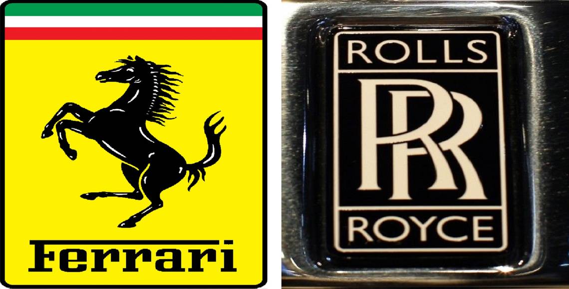
6 Rolls-Royce

If Rolls-Royce is known for anything, it's their insane standards of excellence in every aspect of the production of their cars. Rolls-Royce, much like Apple, has fashioned a timeless brand identity of to-the-point luxury in a three-piece suit. The same RR has been identified with Rolls-Royce since the very beginning, growing in size with each logo iteration.
This image of curated style is furthered by sharply contrasting the minimalism of the logo with The Spirit of Ecstasy, the sculpture of a woman with wings that adorns the hood of every Rolls-Royce. Some brands thrive on maintaining a consistent image and style, and Rolls-Royce is the prime example of this in the automotive industry.
5 Jaguar

Jaguar has placed itself in a unique field with its logo. While they could have settled with a simple symbol, they created a logo that is thought of in the third dimension. By making the Jaguar logo a hood ornament, it draws in the eye and mentally associates the car with the object representing it.
This seems to have been the idea, with the big cat appearing to be jumping off the car, implying forward movement in great leaps. There is not much story behind this classic logo, with the company using a simplistic sculpture of the titular cat. The Jaguar logo is undeniably classic and proves that simplicity can create a long-lasting icon out of almost anything.
4 Ferrari

When one thinks Ferrari, their classic prancing horse comes to mind. This is a fantastic symbol for a company known for cars that emit an aura of power and speed. However, the famous horse was not originally designed to be the symbol for Ferrari.
The horse was first illustrated by Count Francesco Baracca, a famous pilot in the Italian Air Force during World War I. He painted the symbol on the side of his planes. It is not too hard to see why Scuderia Ferrari found this logo fitting for his car company, which strived to achieve the feeling of freedom felt by those who have mastered flight, but down here on land.
3 Maserati

Maserati's trident logo has been there since day one, always kept as the representation of the Maserati brand. However, the story behind the trident, like many classic logos, is quite simple.
The trident is based upon the Fountain of Neptune located in Bologna's Piazza Maggiore. Apparently, the use of the Trident was not to invoke some emotion or idea specifically. The actual story is that Mario Maserati used the trident symbol as the Maserati logo at the suggestion of a friend, Marquis Diego de Sterlich. Although not intended, the simplistic design holds an air of class and history, feeling minimalistic and modern, yet classic at the same time.
2 Chevrolet

The Chevrolet bow tie logo is one of the few logos to not include a name or any design bells and whistles. Like their trucks, Chevy's logo is tough, proud, and humble. However, the true history behind the symbol has always been shrouded in mystery. It was accepted that the symbol was seen by Chevy co-founder William Durant in a Paris hotel, however, Durant's wife said the bow tie was seen by her husband in a Virginia newspaper in 1912.
However, Chevy historian Ken Kaufmann came across a 1911 newspaper advertising Coalettes brand coal, with the company logo squeezed into a bowtie shape. Kaufmann came to the conclusion that the Chevy bow tie was directly inspired by the Coalettes logo.
1 Bentley

Recently, Bentley announced they would be entering the world of luxury home furniture. While amusing to talk about, this addition to Bentley's operations only makes sense for a company so tightly tied to wealth, style, class, and legacy.
Bentley's logo is one of the most humble and simple. The “B” obviously stands for Bentley, encased in wings. Wings are a classic symbol of speed, freedom, and hope, and Bentley seems to employ all these definitions. In essence, Bentley's logo perfectly resembles its cars: sleek, classic, meticulous, yet modest. The Bentley logo is proud but reserved, a mirror of the low-key excellence of their timeless automobiles.