Let’s face it, most of us think of The Queen, Meghan and Harry or perhaps Kate and William when we hear the word “royalty.” Terms like monarchy, aristocracy, and royalty appear as antiquated notions in an age when we play tennis in the virtual world, drive Ferrari in the Metaverse, and buy goods with crypto. But while some of us might see the monarchy as an outdated or even obsolete system of government, there is still wide respect for the qualities associated with the royals, such as excellence, wisdom, grace, and character. Not surprisingly, over the years, various brands wanted to be associated with royalty; hence, they created a visual identity that uses the aristocratic flair and incorporates royal imagery. But while this strategy works very well in countries like Belgium, Spain or the U.K., it's always surprising when an American brand uses it.
Cadillac, the brand loved by a different type of royalty like Elvis Presley, the King of Rock n’ Roll and Frank Sinatra, the King of Swing has selected an emblem, which conveyed the brand’s union with royalty. The original Cadillac coat of arms was also an ode to the family crest of Antoine de la Mothe Cadillac, who founded Fort Pontchartrain du Détroit (aka Detroit) in 1701. Naturally, there’s also Cadillac’s very own history that conveys the idea of American royalty. Let’s not forget that Henry M. Leland and various Henry Ford Company investors founded the Detroit-based company in 1902. And if there is a family in the U.S. that comes close to royalty, that’s the Ford family. However, let's dig deeper, as we unravel the significance of the Cadillac logo.
The Cadillac Logo: The Meaning Of The Coat Of Arms
Back in 1905, Cadillac released its first vehicles with the company’s emblem. One year later, it already registered it as a trademark, securing the rights to its logo.
“The coat of arms symbolizes pioneering and leadership in the automotive industry,” said a GM press release.
According to the Cadillac and GM, the emblem has two distinctive parts, the coat and shield. But here’s where things become interesting, and we can see the association with royalty and aristocracy. “The couronne, or Coronet, symbolizes the six ancient courts of France,” says GM. “The pearls, which are varied in number on both the family and automotive crests, signify that the family is descended from the royal counts of Toulouse.”
As one can imagine, the shield signals the bravery of a noble family, and it has four distinctive parts. The first and fourth part show the arms of the Mother family, whereas the second and third parts were supposedly added to the Mothe coat of arms after a successful marriage which grew the family’s wealth.
The Cadillac Logo: How It Has Changed Since 1905
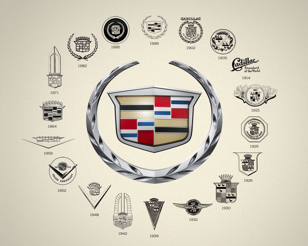
Reputable companies are constantly evolving and growing. Naturally, they also change the way they approach customers, how they communicate with their fans and how they engage with them. Changing the logo and the design elements that define a company is not out of the ordinary, and some car manufacturers have done a fantastic job with their logos throughout the years, while others have failed to innovate. Take for example, Cadillac’s “wreath and crest”, which has evolved together with the company, being constantly updated to reflect a more modern look.
The original logo launched in 1906 was showcasing the aristocratic bloodline of the family and their connection with the royal counts of Toulouse, but it was too embellished for an emblem. Additionally, the crown, swans, tulips and circular lines that appeared in the original logo were too feminine for an automotive company that wanted to communicate power, masculinity and fierceness.
After various attempts, in 1933, the company came out with a contemporary emblem. The new logo featured a shield that was closed in by a pair of wings. This emblem uses the color black in abundance and spotlights the shield; a move that makes the entire logo look more aggressive and modern. However, the original swans are still present. During the pre-war period, in 1939, Cadillac embraced its most manly logo. This was an elongated triangle that resembled the tip of a sword, razor-sharp and belligerent looking. Meanwhile, the crown is emphasized to communicate the aristocratic background of the brand.
Another important change came post-war in 1948, when color was finally added to the emblem and modern design elements replaced the ones from the original coat of arms. The V-shaped symbol was a smart touch because it accentuated the image of the crown.
In 1963, Cadillac returned to the wreath style, abandoning the V-shape for a more polished look. The shield is still colored and the stripes and swans are also present, but the design is updated. Another major change came in 2009, when the designs elements that came to define the brand vanished. Cadillac replaced the swans, for example, with colorful stripes. The silver wreath frame is also modernized, taking a 2D- 3D look. Last, in 2014, the silver wreath frame disappears for good and the entire design looks sharp and vigorous. For this logo, Cadillac has put the limelight on the colorful stripes and lines.


