It’s difficult to imagine a more suitable symbol for American exceptionalism than the Chevrolet Corvette. For decades, this car has dominated the automotive landscape despite unprecedented cultural and political changes. Because of the incredible popularity of the Corvette, Hollywood couldn't help but fall for its charm, featuring it in various Blockbusters, alongside some of the most famous people of the Twentieth-century.
From American Graffiti and Corvette Summmer to Terms of Endearment, which featured the legendary Shirley MacLaine and Jack Nicholson, Corvettes have appeared in several movies that have become cult classics. Naturally, this has only boosted the brand’s appeal and its awareness, transforming the Corvette into a roaring success.
Despite being a mega-hit and icon in the United States, few people in foreign markets know about Corvette’s racing history at Indianapolis 500 and Le Mans, business strategy, collector editions or even design elements. And even fewer know the true meaning behind the model’s logo. Therefore, let’s have a look at the symbols that define this iconic brand.
The Hidden Meanings Behind The Corvette Emblem
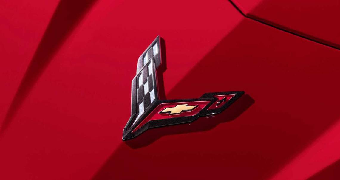
Chevrolet has chosen a logo for the legendary Corvette that has deep meanings for the brand. It is a testament to the history and heritage of the Chevy brand and an ode to American exceptionalism. Furthermore, the logo bridges the French (European) culture with the American one through modern symbols and design elements. For instance, the fleur-de-lis (the flower of the lily) illustrates the French roots of the Chevy founder, whereas the bowtie alludes to America and the strength of its authoritative brands.
Meanwhile, the racing flag hints at Chevy’s (and Corvette) powerful racing soul. Not for nothing, Corvette cars will run at Indy 500 and 24 Hours Le Mans races. Without a doubt, most of the Chevrolet Corvettes will remain in history as cars that exemplify America’s exemplary spirit, being models for safety, groundbreaking innovation and engineering.
The Chevrolet Corvette: Long Road From The Original Logo To The Modern One Used Today
The Chevrolet Corvette emblem has been changed several times in the past decades, however, some design elements were maintained. Brand enthusiasts know that the French roots of Louis Chevrolet, the founder of the iconic company, played an important role in the original logo.
Accordingly, Chevy has turned to the beautiful fleur-de-lis, when looking for motifs for its badge. Another design element selected by Chevy was the flag, but even before the logo was released the two crossed flags created some controversy. This happened because the designer, Robert Bartholomew, wanted to have the American flag alongside a racing flag.
Unfortunately, the National Flag Code adopted in the United States in the 1940s restricted the use of the national flag for any commercial products, according to WheelZine; thus, Chevrolet was forced to scrap the American flag from its badge and use a red flag that had the Chevy bow tie and the fleur-de-lis imprinted on it.
In contrast to other car manufacturers, Chevy didn’t alter Corvette's logo substantially, as there were only some minor changes made over the years. For instance, during the first round of alterations, Chevy only enlarged the two flags and eliminated the white background. In addition, the American automotive company got rid of the words Chevrolet and Corvette. Later on, Chevrolet released a new badge for the Corvette, which was used for the Mako Shark. For this logo, Chevy dropped the circle and emphasized the two flags.
From the early 1980s all the way to 1996, Chevrolet used the circular frame around the flags, but it eliminated the flag poles. The fleur-de-lis also disappeared, and the checkered flag switched position, ending up on the left side. Meanwhile, the Chevrolet bowtie ended up on the right side. In 1997, the fleur-de-lis was brought back once again, and it was placed on the right side, positioned on the red flag together with the iconic Chevy bowtie. Later, between 2005 and 2013, Chevrolet abandoned again the circle frame and the flagpoles, and used well-defined lines and a more modern design. The badge used between 2014 and 2019 is similar to the predecessor, although it is thinner and longish.
Elsewhere, the Chevy bowtie and the fleur-de-lis remained on the red flag found on the right side, whereas the checkered flag is on the left. Also, “Corvette” is written in a metallic shade, whereas for the earlier model, the word was written in black. Chevy launched the latest emblem in 2019, but there are hardly any differences if we compare it to the previous logo. The only thing that is evident, is the size of the emblem, as the latest one is smaller and more compact.