Every auto manufacturer has a distinctive logo or insignia that embodies their values and demonstrates their aspiration. The majority of automotive brands employ solo or incorporated combination marks that blend expressive symbols with succinct visual design for optimum influence and adaptability, while others opt for a streamlined logotype.
Similar to most industries, the car logo design plays a significant role in the company's brand identification. In fact, it represents the feelings the brand wants its customers to feel through the engagement and purchase process. Furthermore, when it comes to choosing a car, people have a plethora of alternatives. This is where the trademark status of the car influences the buyers with branding.
Aside from its brand awareness and endurance, each badge has a unique tale to share about its origins and development. Let's take a look at the 10 most iconic automotive logos and the fascinating stories behind them.
10 Aston Martin

Aston Martin, one of the world's most prestigious automobile companies, has a long and illustrious heritage, much like its logotype. Despite being founded in 1913, this British car maker did not have a logo until 1921, and for the first seven years, the firm only utilized its wordmark.
Originally, the badge featured a golden background ring intersected with brands initials "A" and "M" in black color. However, in 1927, the emblem was drastically altered, with the addition of iconic wings, which emphasized speed and was allegedly influenced by the Bentley ‘Winged B' design.
During the 1930s, when the design was slightly modernized with wings getting flattened, it was said that the open wings of the scarab beetle were the inspiration for the wings badge, which goes back to ancient Egypt, but it was actually to represent the climb up of Aston Hill, as well as the genuine sense of liberation that comes with fusing luxurious design with classic performance.
9 Subaru

Subaru's badge is an integral part of the brand's progression and a sign of the company's transformation from nothing to a successful automaker. When Fuji Heavy Industries (FHI) founded the Subaru brand in the early 1950s, its president, Kenji Kita, opted to name the Japanese auto manufacturer after the Pleiades star cluster M45 in the Taurus constellation.
Pleiades, popularly referred as Seven Sisters is the actual inspiration of the brand's logo. Although based on seven star constellation, the design portrays only six stars. This is due to the two stars in the Pleiades constellation which are so close together that they appear to be one huge star. Subaru employed this pattern to symbolize its parent company, FHI, as the large star, and its five subsidiaries as the smaller stars. Moreover, the Pleiades stars' hues are represented by the badge's blue background.
8 Rolls-Royce

Rolls-Royce is perhaps the most elegant marque in the automobile industry and its cars exemplifies class and luxury, with each piece being handcrafted and assembled. Apart from the two R and Rolls-Royce typography on the insignia, it is also emblazoned with the well-known "Spirit of Ecstasy" which wasn't common until the 1920s. This symbol is used as a bonnet adornment but it has a fascinating backstory.
Lord John Montagu, a friend of co-founder Charles Stewart Rolls, sought to embellish his Rolls-Royce with a sculpture of a beautiful and lovely feminine presence. He then commissioned sculptor Charles Sykes to create a mascot in the style of "the Whisperer," but with famous actress Eleanor Thornton as the model. Sykes was later asked to design a mascot for all Rolls-Royces, and he provided them with a customized version of the one he created for Montagu, which is now considered the car's masterpiece.
7 Porsche

Porsche is a renowned sports car manufacturer whose distinctive badge commemorates the company's hometown. This stunning piece of artwork, which resembles a coat of arms for a lineage of fast cars, set it apart in the competition for the most iconic logo. In 1952, the logo was created by combining the coats of arms of the Free People's State of Wurttemberg and Stuttgart. It does, however, have an intriguing story to tell.
In the early 1950s, Max Hoffman, a US importer, advocated to Ferry Porsche, the son of founder Ferdinand Porsche, that the Porsche 356 should have a logo like other automakers at the time. Ferry enjoyed drawing coats of arms and was immediately drawn to the idea of incorporating heraldry into the design as he quickly sketched the first impressions of it on a napkin in New York.
The concept was later modified by designer Erwin Franz Komenda before it was eventually used on the Porsche 356 in 1953, albeit just on the steering wheel hub. The insignia was prominently displayed on the hood of a Porsche 911 in 1963.
6 Toyota

Toyota is famous for producing durable and efficient vehicles, and its logo effectively conveys the company's commitment to its consumers. Toyota's inaugural logo was a red and blue diamond-shaped emblem. However, over the course of its existence, Toyota has gone through various logo iterations, before landing on the iconic three overlapping ellipses.
This classic logo was developed in 1989 to celebrate the firm's 50th anniversary, with a view to its expansion in the global market and the need for a symbol to express its competence and vision. The badge's inner ovals signify both a customer's and the company's heart. The overlap of the ovals represents a mutually beneficial and trusting connection between the consumer and the corporation, as well as a ‘T' shape for Toyota. The exterior oval symbolizes worldwide acceptance. Each oval was curved with varying stroke thicknesses as characteristics of Japanese calligraphy art and culture.
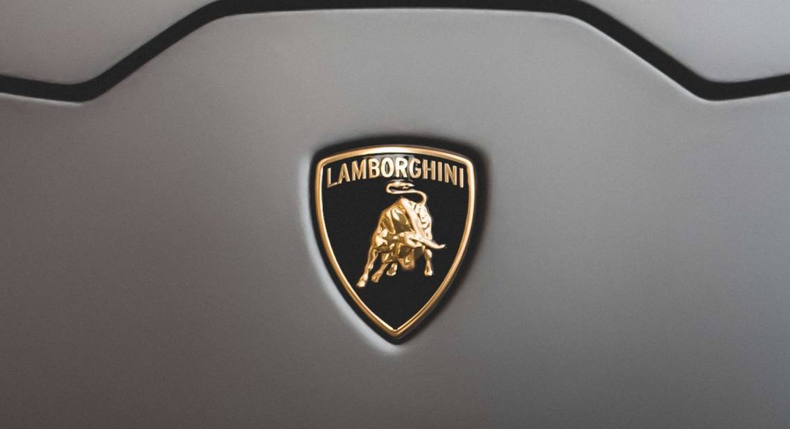
5 Lamborghini

Lamborghini is a legendary luxury sports car manufacturer that has always had enthralling stories to tell, from its roots to its vehicle badge. This company was founded in 1963 by Ferruccio Lamborghini in Italy, resulting in a classic example of branding rivalry.
In 1962, when Ferrucio visited the Seville ranch of Don Eduardo Miura, a well-known breeder of Spanish fighting bulls, he was blown away by the majestic Miura bulls. He was so impressed with the 'raging bull' that he decided to use it as the logo for his upcoming car brand Lamborghini.
Secondly, he believed in the cosmos, and his zodiac sign, Taurus, is also associated with the bull, which he thought was a perfect fit. He was also metaphorical with his color selection; the gold in the badge indicates quality and a rich history, while the black represents strength, prestige, integrity, and grace.
4 Ferrari

Launched as Scuderia Ferrari in 1929, Ferrari is an Italian premium sports car brand based in Maranello. Its signature 'prancing horse' logo design encapsulates all they stand for and is by far the most globally recognized badge in the luxury sports car market. Enzo Ferrari, the company's founder, once revealed the amusing story behind this classic horse logo.
After winning a race at the Savio track in Ravenna, Italy, in 1923, Enzo was given the chance to meet the Baraccas in person. He then made a visit to Count Enrico Baracca and Countess Paolina Baracca, the parents of war hero Francesco Baracca, an Italian WWI fighter jet pilot, and it was the Countess Paolina who advised him to paint the prancing horse that their son had painted on the side of his plane during the war on Ferrari race cars as it would bring him good luck. Ferrari made the horse black, instead of red, as it was on the jet, as a token of respect for the great pilot who inspired the renowned emblem and to commemorate his hometown of Modena, he added a canary yellow background.
3 Maserati

Maserati is one of the most well-known automakers in the world, and its cars have always exuded a sense of perfection, which extends to the logo. Three Maserati brothers led the Italian firm in 1914, but it was a fourth Maserati sibling, artist Mario, who designed the famous trident insignia.
Mario Maserati designed a trident after being inspired by a statue of the Roman sea god Neptune in Bologna's Piazza Maggiore. Neptune's trident is a weapon that signifies strength and the ability to control water. The brothers opted to include the trident on the emblem after the suggestion from a friend, Marquis Diego de Sterlich, to signify force in the racing business as well as their birthplace.
2 Cadillac

The luxurious Cadillac brand has been around for over a century, and its emblem has gone through roughly 40 different iterations throughout that time, representing changes in the company's design and cultural orientation. It all started with the colors of the crest which were inspired by Le Sieur Antoine De La Mothe Cadillac, Detroit's founder in 1701. As a result, the logo was designed to match the original Cadillac coat of arms in terms of color.
Interestingly, the characteristic ducks that used to be found on Cadillac badges but were phased out decades ago as the symbol was modernized and modified were actually Merlettes, a sign of knightly engagement in the Crusades. The Cadillac coat's striking splash of crimson was picked to represent courage and valor. Furthermore, the laurel leaves that surrounded the crest were recently removed from the logo in an effort to modernize and expedite the emblem as the firm moves forward with an audacious turnaround strategy.
1 Mercedes-Benz

The three-pointed star of famous marque Mercedes-Benz is already a formidable display of precise German engineering and luxury craftsmanship, but it has a more enchanting backstory. Gottlieb Daimler, the technical director of the gas engine manufacturer, came up with the concept of using a star in the first place. When he initially started working, he sketched a star above his house on a city postcard and mailed it to his wife, stating that one day this star would shine above their thriving factory and bring prosperity.
In 1909, Daimler-Motoren-Gesellschaft registered the three-pointed star as their badge. Benz & Cie also registered its own logo, which has a laurel wreath around the company's name during the same time. The firm was renamed Mercedes-Benz after their merger in 1926, and the Benz laurel wreath was acquired, which was later simplified into a plain ring in 1933. This iconic logo represents company's universal motorization with its engines dominating the sea, land, and air.