NASCAR is one of the top auto racing series in the United States, and certainly the biggest stock car racing series the world over. Since the late 1940s, NASCAR has been thrilling fans around the globe, although it has certainly taken a hit in recent years and become a much harder series for many to watch, thanks to all sorts of rule changes and attendance problems.
One thing that has always been constant in NASCAR though are the liveries, because no NASCAR is complete without a mad sponsor filled livery. But does that mean that all liveries are good? Well not quite.
See, over the years, there have been some truly awful livery creations in the NASCAR world. Why? Well, that is indeed a very good question. Sometimes that is just the way it goes. A lot of the time a livery is dictated by what a sponsor says or does, and that is usually what will then be put onto the car.
Sometimes liveries are chosen for pure publicity, such as one or two in this list here. It is interesting to see the huge variation in liveries throughout the NASCAR field, and you can be sure that there will be bad liveries throughout NASCAR for the rest of its days. This is just a snippet of some of the oddest NASCAR race cars to ever hit the track.
20 Daytona 500 2019 – ‘Face car’

The 2019 Daytona 500 saw a very interesting livery sported by Cory LaJoie’s car. And indeed it has featured after that race as well. He decided that he would feature his own face on the car. But not just the hood. But his entire face would adorn the entire car. So his mouth was the grille, the face was the hood and the rest of his head would flow over the rest of the car. It hasn’t worked out great for this head scheme. His face and mouth have taken poundings at Daytona and also latterly in the second race of the year.
19 Tony Stewart ‘Back To School’ Office Depot

This has been one of the most puzzling schemes on this list. Not particularly terrible but certainly a bit odd. Tony Stewart ran a scheme in cooperation with Office Depot, and it took a bit of a back to school theme as the end of the holiday’s approached. I’m not a fan of it by any means. Just feels…weird? That seems to be the popular opinion on Reddit as well, a lot of people just really confused about the livery and why it was actually done. But considering how bad some of the liveries on this list are, it is far from the worst here.
18 Jeff Gordon Megatron

This, this livery is a total monstrosity. I have certainly seen some bad liveries on a NASCAR but this is surely one of the worse out there. Jeff Gordon is one of the most successful drivers in NASCAR history but this surely is one of the most out of this world and awful liveries to ever adorn a NASCAR. I often wonder who signs off the approval on half of these designs, because I’m sure some look great on paper but why they do I have absolutely no idea. Because surely someone could have had a look at this and seen that this is not a good livery in the slightest.
17 GoDaddy (any year)

This might be a bit of a controversial choice, and I can understand that, because GoDaddy’s livery has often been very popular with the fans, both in IndyCar and NASCAR and most notably with Danica Patrick. But has it ever been a great livery? You see, popularity doesn’t mean something is great. Sure it became synonymous with auto racing in America but the bright green has always been a bit in your face and not the best thing in the world. Danica’s last two races in GoDaddy colors ended in accidents, so hardly the best way to say farewell to such a livery.
16 Prilosec (2010)

Prilosec featured on a NASCAR in 2010 and featured a very, very abstract purple styled livery on the car? What was it like? Well, not very good really. There have certainly been better schemes. The problem is that it is a very confusing livery and it doesn’t look entirely sure of what it wants to be, does it want to be crazy and abstract or does it want to be dull and corporate? That really isn’t clear when just looking at it. I just wish I knew what went through these guys head sometimes, it really does baffle me. Quite a lot.
15 Landon Cassill 2013

Landon Cassill ran this…well, very interesting paint scheme back in 2013 on his NASCAR and I am really uncertain as to what the intention behind it was. Do you want to know how bad it is? It is regularly brought up on Reddit as one the worst NASCAR liveries of both recent and all times. It is just way too busy and too much is going on across the whole car, I quite frankly have never seen anything like it. It is just a total massive eyesore and something I hope I never have to see again once I have finished writing this article.
14 Kenny Irwin Jr 1997

Kenny Irwin clearly liked bright colors. Because, undeterred by the infamous Dodge Magnum livery, he decided he would have a rather bright color scheme on his car as well. Again, why? We have already seen, from history not long before this car, that sometimes the bright colors idea just doesn’t work and it really doesn’t work on this #27 car either, plain and simple, it's awful. One day designers will learn how to do bright colors. Look at this year's McLaren F1 car. Now that is how a brightly colored car is done. Not like this. Thank god this thing stayed in 1997.
13 Jamie McMurray Lexar 2013

Now we come onto a livery that is a little bit more recent. This one from Jamie McMurray, who raced his last NASCAR race in the Daytona 500 this year. 2013 saw Lexar sport a color scheme on his car and this is the result of that partnership. It really was not that great, and just a sloppy mess that quite frankly McMurrary probably was not that happy to run with. I am quite confused with what is going on at the front of the car, it just looks all messed up and like the designers didn’t really care that much if it was pleasing to the eye. Maybe I am being too unkind.
12 1978 No. 6 Marty Robbins Dodge Magnum - Marty Robbins

It is not very often that pink and yellow can combine to make a good color scheme, and sadly Marty Robbins found that out in 1978. His Dodge Magnum sported this bizarre combination of colors that year and it was…well, colorful. It sadly is quite an eyesore, and no doubt the racing overalls to match didn’t go down that well either when mixed in with that livery. It is perhaps why a lot of color schemes these days in some series are sadly quite dull, because more vivid schemes are quite often very hard to get right. It is a shame that that is the case.
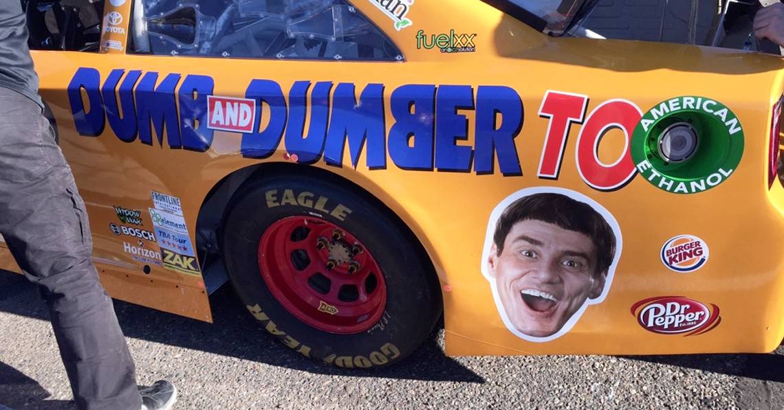
11 Alex Bowman and JJ Yeley – Dumb and Dumber cars

Alex Bowman is now a familiar name at Hendricks Motorsports, and is the protégé of Dale Earnhardt Jr. But along with former teammate JJ Yeley a few years ago, Bowman hosted a very interesting scheme on his car. As did Yeley. The colors of the car were very basic, just blue and orange respectively. But that isn’t what makes this livery so bad. It is the fact the dumb and dumber faces are on the car, which might be a good idea in planning, but executed it really did not look great. It would probably simply frighten your opponent off the road if they were to see such a site in their mirrors.
10 Kim Kardashian #36 – Mike Bliss

I think you would be hard pressed to find anyone that was ever a fan of this color scheme. A few years ago, Mike Bliss ran a rather interesting and celebrity color scheme on his NASCAR. What was it? Well, look at the picture. A god awful Kim Kardashian color scheme really was not what the doctor ordered, and perhaps not what Bliss ordered either. A celebrity scheme was run by Tony Kanaan in IndyCar a few years ago that was Taylor Swift-themed but it was nowhere near as garish as this one by Bliss which is quite frankly horrific.
9 Kevin Harvick #4 2018

Kevin Harvick always usually runs the ‘freaky fast’ color scheme on his #4 entry which just feels very cringe-worthy and not a lot of fun. 2018 saw a few color schemes adorn the #4 entry but this one livery is perhaps one of the worst. It’s a bit dull but also at the same time it feels garish and that it can really hurt your eyes. It is nothing along the lines of the Kardashian scheme, that one was truly awful, but this is just very dull and uninteresting, and only the huge Busch logo brightens it up at all.
8 Kyle Busch/Bush Beer ‘Millenial’ Paint Scheme

As the 2018 NASCAR season approached its climax, the #4 Haas team of Harvick were extremely confident that their car would win the title. So confident were they, that they bet that if they lost they would run this ‘millenial’ inspired color scheme on Harvick's car in 2019. They have yet to run it, but they should. Because Logano was beaten to the title by Penske’s Joey Logano. Not only is this scheme disgusting, but it also is a bit of an insult to ‘millenials’ and a bit stereotypical. At the same time, it would be nice to see Haas run this, because it would just be funny.
7 Dave Blaney Florida Lottery

Dave Blaney ran this Florida Lottery scheme a few years ago, and what’s wrong with it? Well, I wouldn’t say there is a huge amount wrong with it. But there really isn’t much right with it either. It is boring, very boring, and they have not made very full use of the colors, an orange and white which would actually combine quite well to make a decent livery if it wasn’t for the fact the designers of this car livery clearly fell asleep during the design process. Florida Lottery may well have wanted their money back when they saw how average this scheme was.
6 J Allmendinger, Phoenix Racing 2013

Remember when I said that sometimes bright colors don’t mix? Well, A.J. Allmendinger and his team decided to teak a leaf out of the yellow and pink book and try out another color scheme with those two colors mixed into it and it appeared on the Phoenix Racing car in 2013. And it was awful. The colors were way too bright and way too in your face, and is probably much worse than Marty Robbins Dodge Magnum, which is saying something given how bad that color scheme was. So fair play really to Phoenix Racing for actually designing a worse edition of something that’s bad already.
5 2014 Danica Patrick pink and green Go Daddy

Danica Patrick surely had to feature on this list, she had to. After all, it would be rude to talk about the Go Daddy paint scheme if we didn’t at least feature a Danica Patrick specific scheme on the car. 2014 saw the Go Daddy car take on a slight twist, and this mixture of green and pink appeared on the car for a brief period. The GoDaddy scheme itself was bad enough but this really did take things to another level. Thankfully, this livery was not seen that often and given that Patrick no longer races at all, and that GoDaddy is still tied to her, we probably won’t see this again.
4 Matt Kenseth #94 ‘Big Mac’

Matt Kenseth is a familiar name when it comes to NASCAR, even if he is no longer racing in the Cup Series. He was a longtime fixture on the NASCAR grid but ran something rather interesting many years ago, and that was a Big Mac sponsored scheme from McDonald's. Jamie McMurray has run a McDonald's scheme for many years, and it was never bad really. This though is just a bit too much and a bit in your face.
3 Jeff Gordon FarmVille

Jeff Gordon features again, one of the most successful drivers in NASCAR’s history. Is this one of the worse liveries that he has ever had to use? Probably. This Farmville livery has been executed rather badly, and It hurts my eyes just typing about it and only catching it from the corner of my eye. Why this was thought of and why they thought it would be a good idea? Well, your guess is certainly as good as mine. Nothing against FarmVille being on the car at all but surely we can all see that it should have been just thought of that little bit better.
2 Jimmie Johnson Madagascar livery

Jimmie Johnson is another of NASCAR’s most successful drivers, although it has been a leaner period for him in recent times. This livery feature on a Chevrolet Impala is not one of the best ones that we have seen. It features Madagascar on the car, which has been a popular series of films for years, especially for younger kids. But on a NASCAR? Well, it really does not translate too well and I have certainly seen much better. It is very similar to the scheme that featured on Jeff Gordon’s Madasgar car, not one of the best liveries in NASCAR history at all.
1 Jeff Gordon 3M Scheme

Finally, we come to another Jeff Gordon livery. Although these are not done in any particular order I did leave this until the end as I wasn’t sure it was the worst. What makes it bad is how unbelievably bland it is. It is really, really bland indeed. One of the most boring and corporate liveries on this list for sure. Of course, the main aim of a company is just to simply showcase their colors and their company itself in order to maximize revenue but sadly a lot do tend to take a bit of a boring style when it comes to the color schemes and this 3M one carried by Gordon is a perfect example of that.
Sources: Reddit, Wikimedia, Jeff Gordon, Bad Groove, CDN