All components of the car have to match for the car to be visually appealing. The external and internal designs of the car have to match, as well as the car's color. Once those components are in sync, the next piece that car manufacturers focus on is the logo.
Branding a car is about developing a logo that suits the style of cars that the automaker manufacturers. If the car's exterior design is attractive though the logo is eccentric, it could degrade the car's value. That is one of the reasons that automakers have evolved its logos.
Most of the top car brands have been around for a century and had to evolve with the times. Automakers not only had to change the style and the components of the vehicle to remain relevant, but the companies had to develop new logos. Some automakers had changed the design of their logos several times during the last few decades. When the manufacturers felt its logo was outdated, the companies unveiled a new design to rejuvenate its brand.
We wanted to see what the original car logo designed looked like to compare it to the contemporary one and find out the story about the design change. Our search led us to discover prominent automakers who evolved with the times by designing new logos.
20 Alfa Romeo
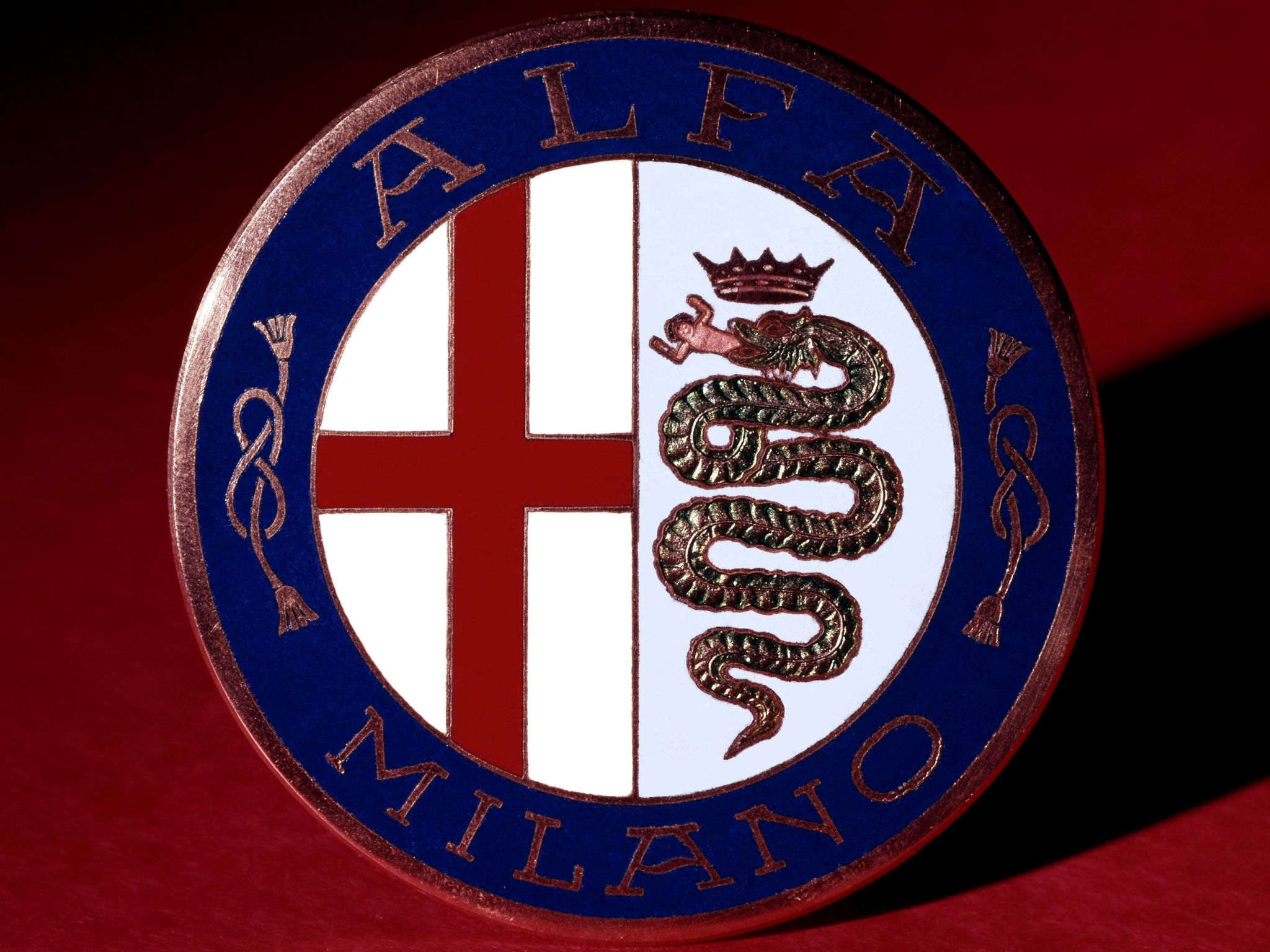
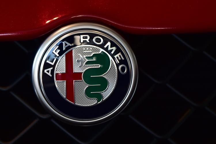
The logo originated when the company was called A.L.F.A. The abbreviation stands for Anonima Lombarda Fabbrica Automobil. According to Fiat of Kirkland, the automaker wanted affiliation with the city of Milan by using the red cross that was a symbol of the crusades in the city. The second half of the image depicts a serpent eating a man.
The snake on the new symbol depicts one of the most important families in Milan - the Viscontis. Otone Visconti, a knight, fought against a noble Saracen knight. To commemorate his efforts, Alfa Romeo wanted to include him on the new symbol. It seems that the automaker is proud of its heritage.
19 Aston Martin
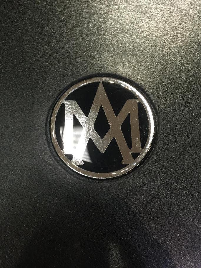
When Aston Martin introduced the logo in 1921, it merged the letters A and M inside a black double-line circle. The logo has undergone several alterations since it debuted. The company adopted the winged design in 1927, with the company's name on a pair of white wings. Aston Martin has simplified it since then to ensure contemporary design aesthetics. A wing is a traditional symbol of freedom, speed, dream and exploring boundaries.
The colors that Aston Martin chose for the new logo, launched in 2003, represent prestige, elegance, and excellence. The new logo makes the Aston Martin brand a powerhouse that it is when compared to the simple design that the first logo had. The automaker also made a good choice of spelling out both words instead of using only the first letters.
18 Audi
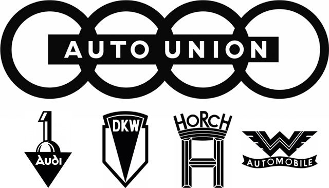
Audi has been a majority-owned subsidiary of the Volkswagen Group since 1966. The company name is based on the surname of the founder, August Horch, translated into Latin as Audi. The Auto Union logo that the company unveiled in 1932 contained four ceiling rings, representing the four manufacturers of Auto Union: Horch, DWK, Wanderer and Audi.
The automaker changed the logo in 2009 to celebrate Audi's 100th anniversary. The chrome color of the rings makes the logo seem modern and sophisticated. Instead of using the names of the four parties involved, the automaker chose to represent their involvement by using rings.
17 BMW
Many people believe that BMW based its logo on a spinning propeller. Bayerische Motoren Werke (BMW) launched the first logo in 1927. The automaker has redesigned it a few times with no significant changes. The design of the logo stemmed from a combination of the Repp Motorenwerke logo, representing the company's growth, and colors of the Bavarian flag.
The evolution of the logo has been subtle, as BMW implemented slight color changes and a shift from serif to sans-serif typefaces, as well as the addition of lighting and bevelling on the recent version. Although the new logo looks modern, the designers kept the original design while designing the new one.
16 Cadillac
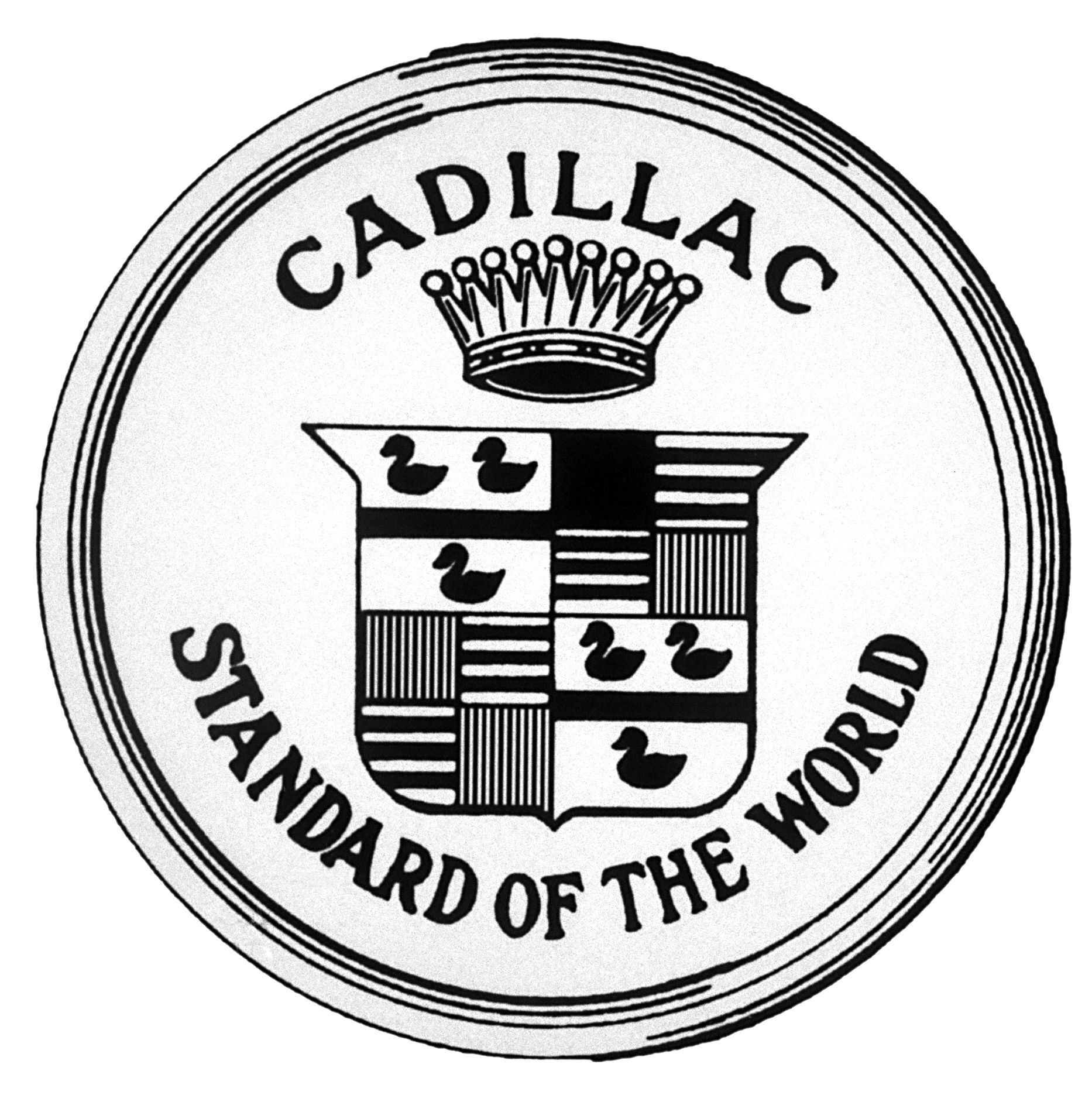
Although Cadillac is under General Motors' ownership, the company received its name from Antoine de La Mothe Cadillac, who founded Detroit. The first logo contained a pearl top crown and the ducks, which the new logo doesn't contain. Since the company's inception in 1902, Cadillac's logo has gone through several changes.
Cadillac got rid of the letters and combined several colors. To make the logo more elegant, Cadillac placed a wreath around the colors. The company decided to get rid of the wreath and used only the colors for the logo. I think getting rid of the wreath was a smart decision considering the colors were sufficient in representing the brand.
15 Chevrolet
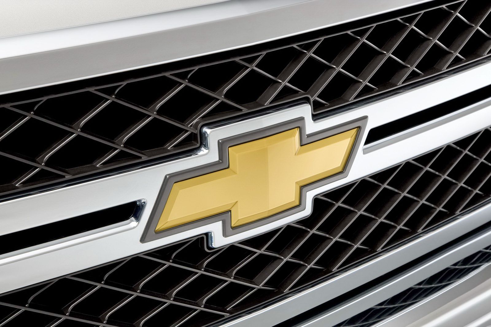
Chevrolet has become one of General Motors' most popular brands. Louis Chevrolet and William C. Durant founded the company in 1911. Durant introduced the first logo in 1913. While many people believe that Chevrolet was responsible for the design, it was Durant who used inspiration from a wallpaper in a French hotel to design the company logo.
The new logo, decorated with a silver border, has gold and yellow. The horizontal parallelepiped is overlapped by the square to form a cross-like figure. The logo's design looks like a cross and a bowtie. Many experts claim that the new logo means more than the bowtie and cross, which represent sophistication and class.
14 Chrysler
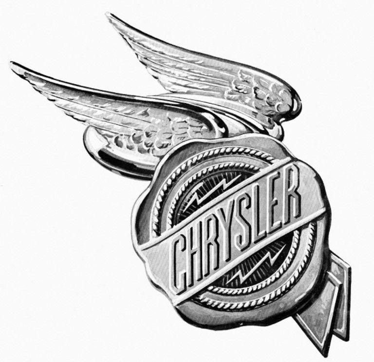
Walter Chrysler founded the company in 1925 by using the remains of Maxwell Motor Company. The company expanded in 1928 when Chrysler acquired Dodge Brothers and Fargo Trucks. Walter Chrysler wanted his company to be in the same league as Cadillac and Lincoln. He needed a logo that gave the impression of a high-quality brand, according to Money Inc. The engineering team designed two logos in 1924.
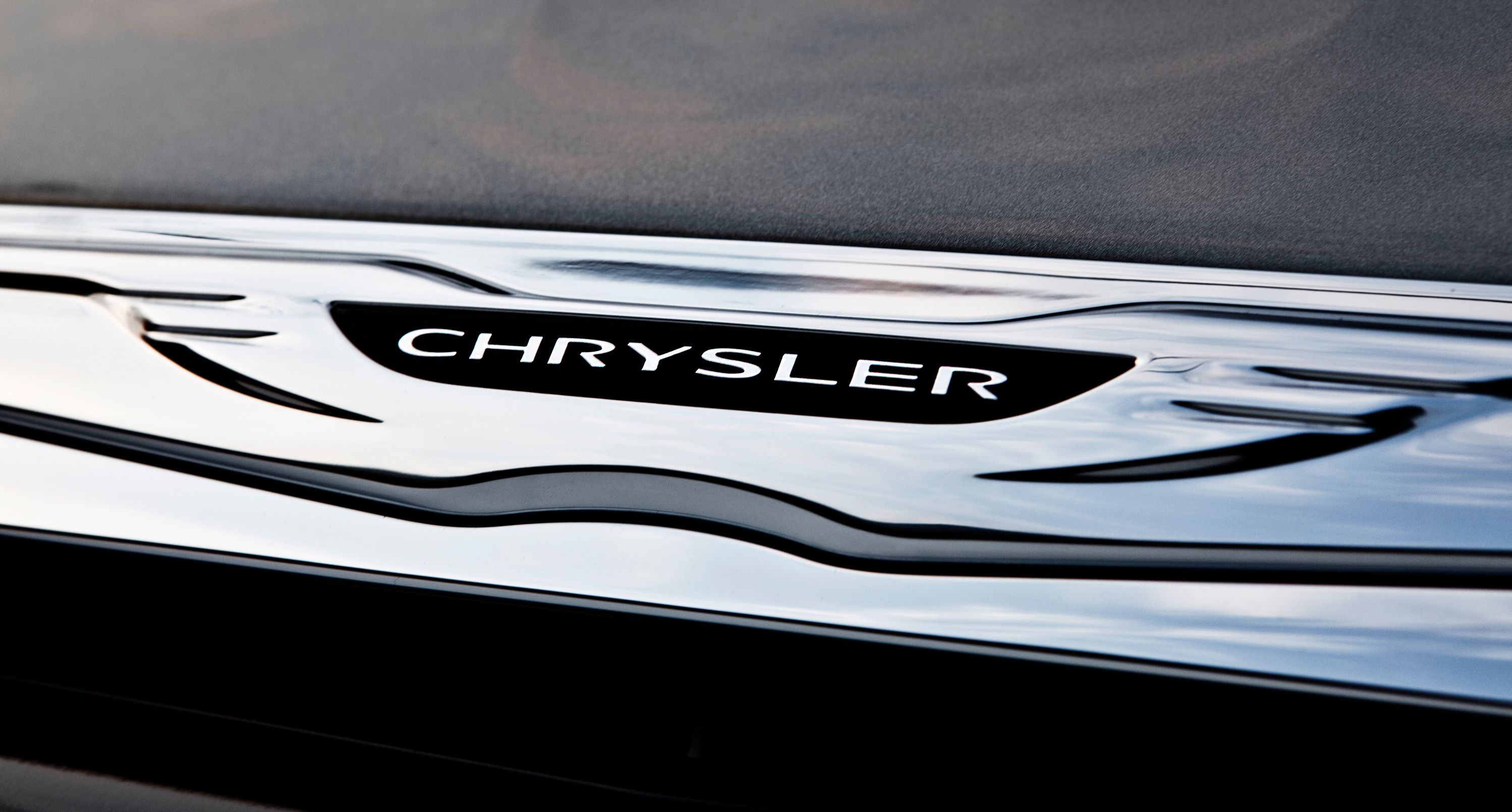
The original design represented a wax, intended to symbolize the premium quality of the vehicles. When Fiat acquired Chrysler, the engineers removed the wax seal and replaced it with the world Chrysler in capital letters. The new logo makes the brand seem like it produced elegant cars. Although some of the brand's car, such as the Crossfire, look appealing, the automaker should improve the reliability of most of its cars.
13 Fiat
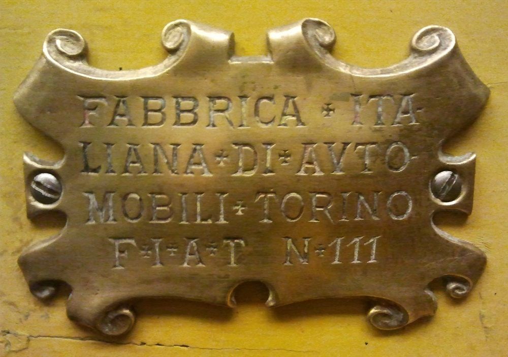
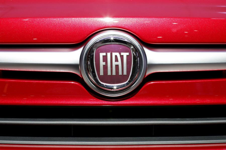
Fiat's logo has seen numerous changes since Giovanni Agnelli founded the company in 1899. While all of the logos contained the FIAT in capital letters, the logo designed in 1899 paid homage to the manufacturer. That logo stated the abbreviation of FIAT: Fabbrica Italiana Di Avtomobili Torino, lasting until 1901 when the automaker changed it.
Engineers formed the new logo in 2006. The new logo contains a chrome shield, depicting the notion of ongoing change. The best part about the new logo is that it abbreviates all the words that the automaker wanted to convey in the original logo. The new logo is simple and to the point.
12 Ford
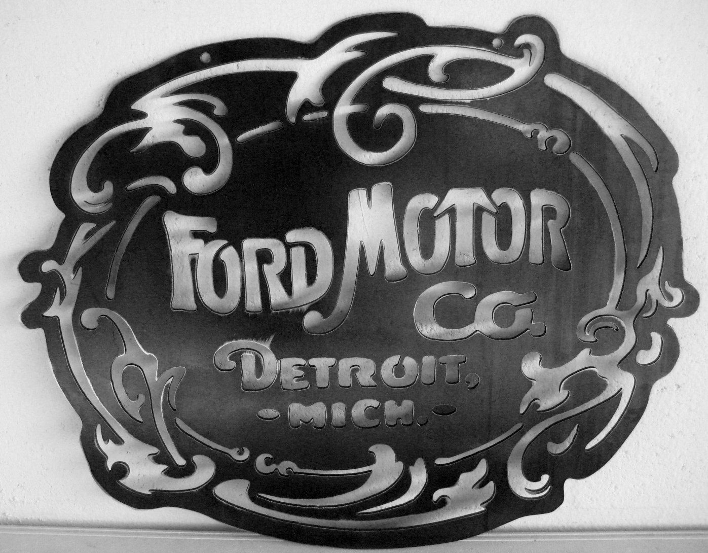
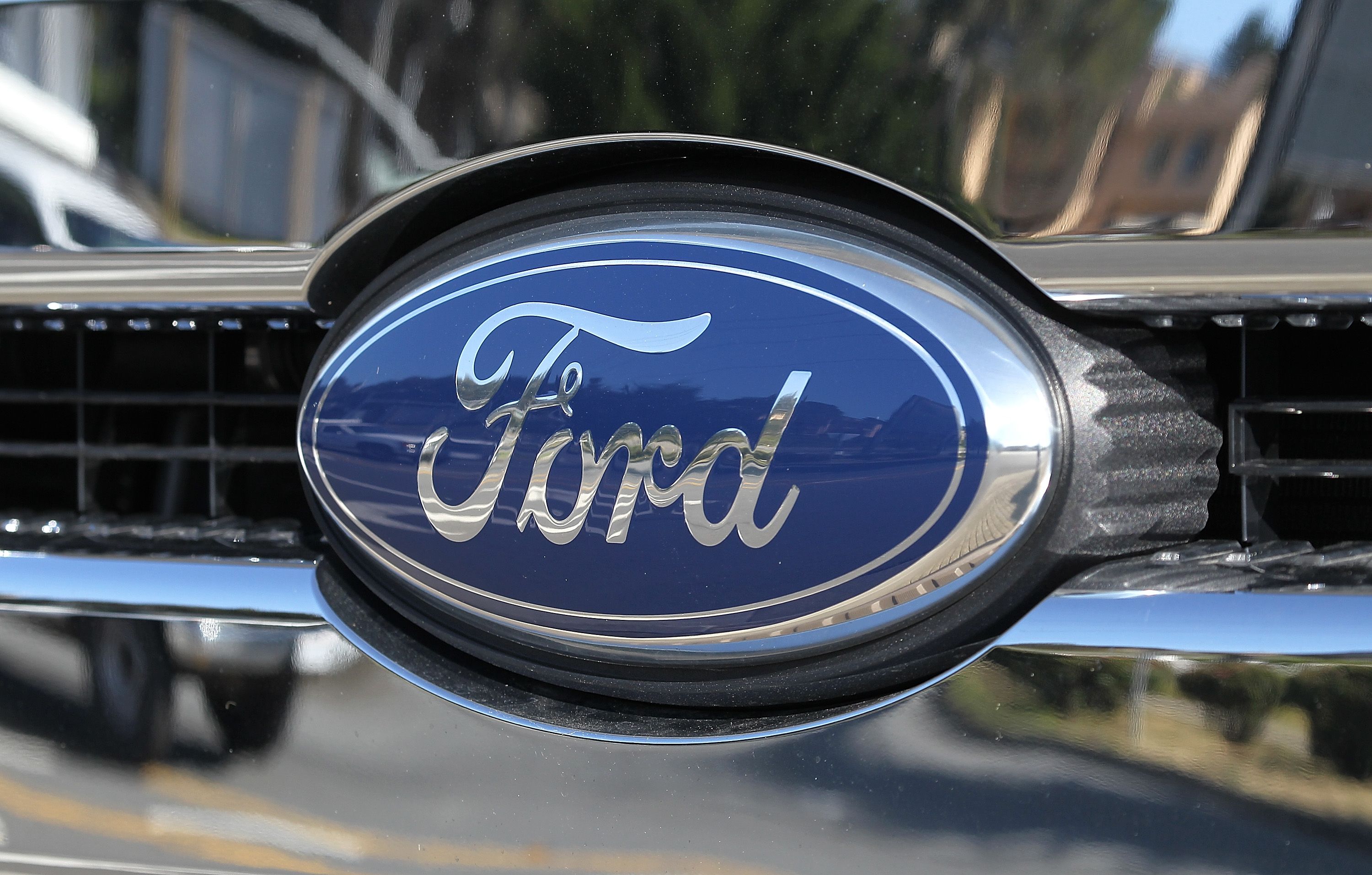
The company unveiled the original Ford logo in 1903. The U.S. automaker had changed the logo in 1909 for the first time and several times since then. The logo had minor changes since 1909. The original design stated the company's full name while the latest one contains only the family's surname.
The automaker wanted to make the logo look more elegant, so it designed it in chrome, cursive letters with a blue background. Instead of using the full company name, Ford decided to use only the family's surname for the new logo. The new logo is short and to the point. The sad news about the company is that it announced it will stop producing most of its sedans by 2020.
11 Honda
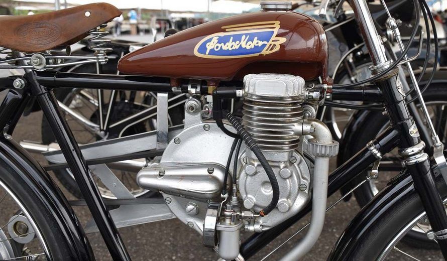
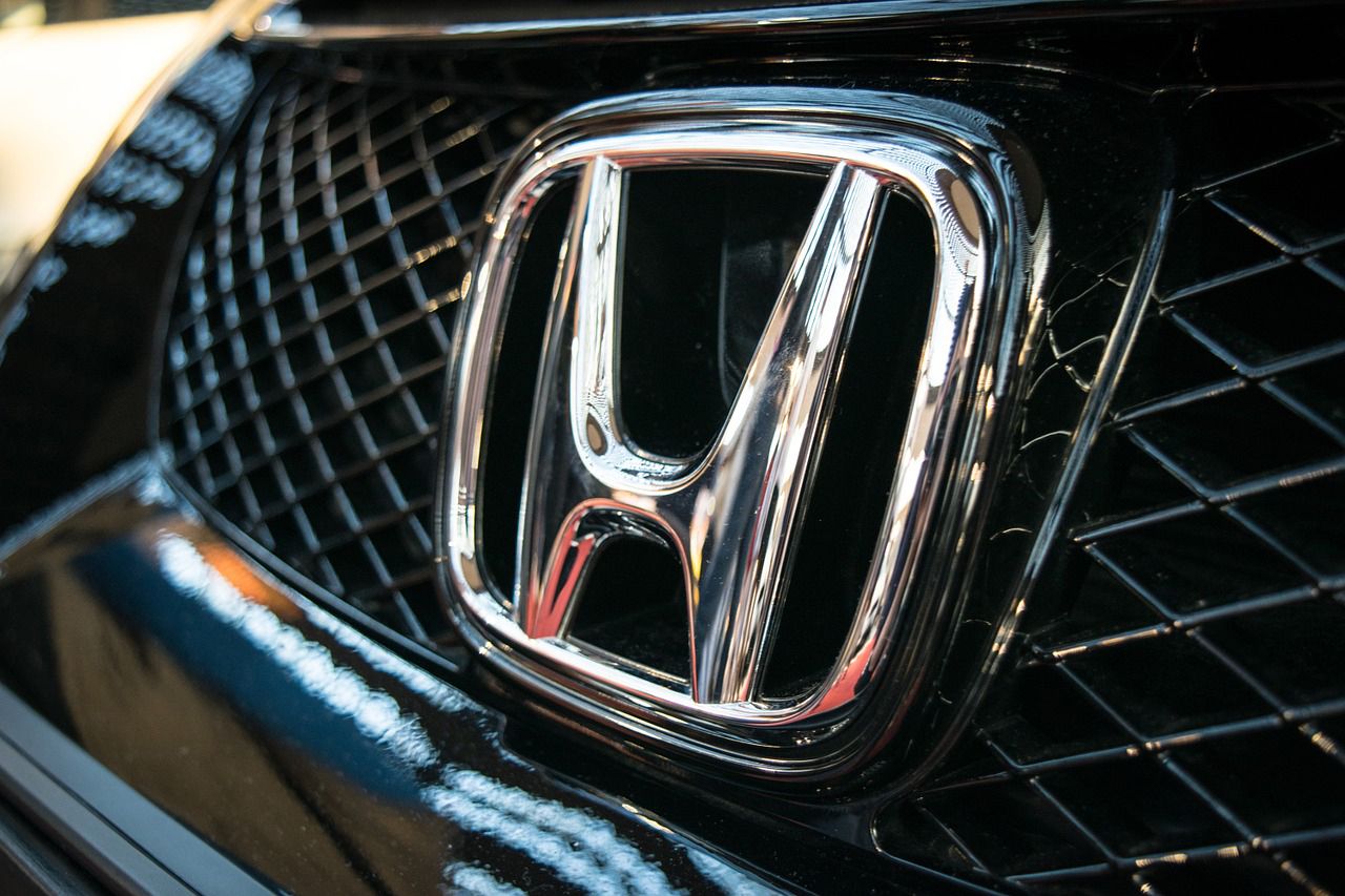
The manufacturer has been the world's largest motorcycle manufacturer since 1959 and the world's largest manufacturer of internal combustion engines, producing more than 14 million per year. The original logo contained the words Honda Motors on the motorcycle.
The writing style that the engineered employed on the original logo made it difficult for anybody to make out what the words were. Since 1988, Honda used the capital letter H as a symbol of its brand. Although the logo is simple, the chrome letter makes the brand look elegant. Considering Honda is one of the best selling brands in the world, most people recognize the H sign.
10 Lamborghini
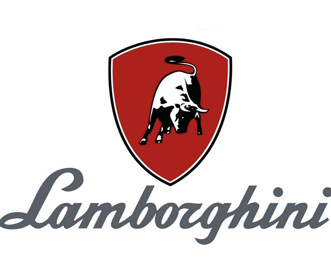
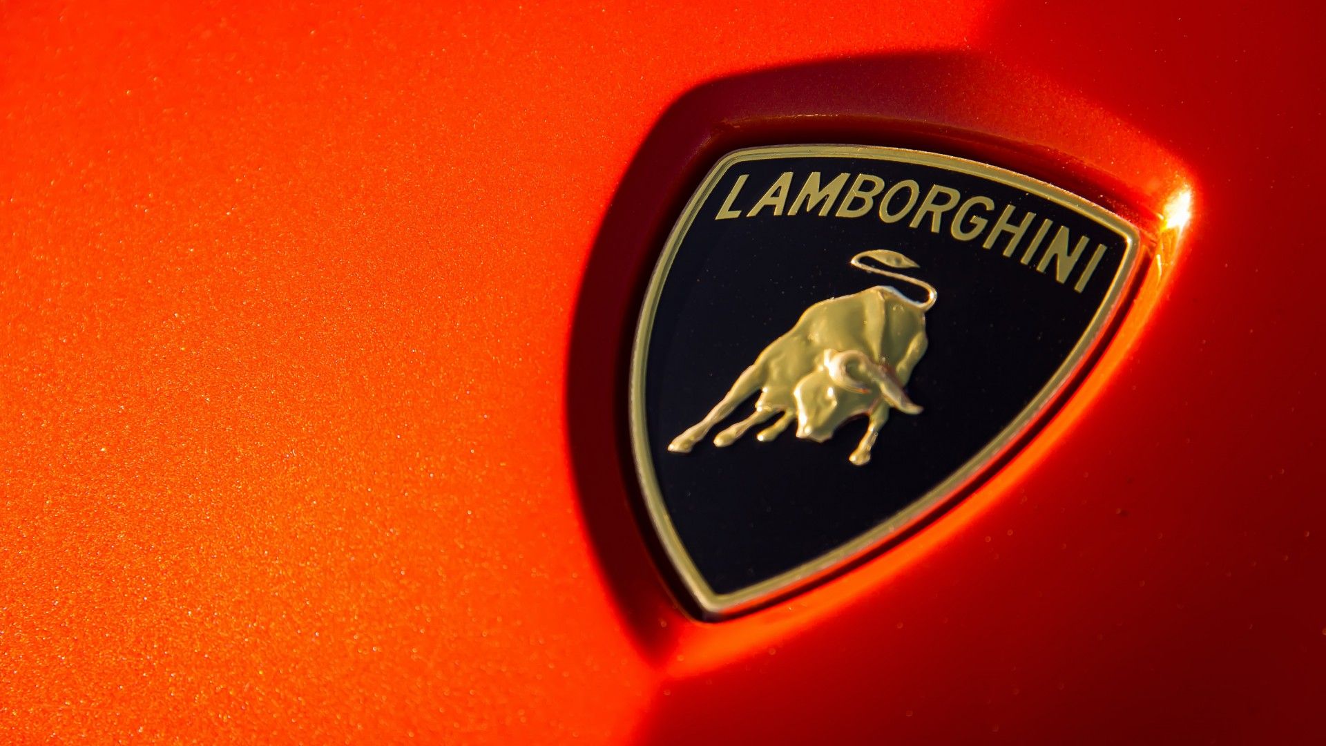
Ferruccio Lamborghini started the supercar manufacturing company after Enzo Ferrari angered him. Since visiting the Seville ranch of Don Eduardo Miura, he had a fascination with fighting bulls. Lamborghini called the Miura after the bull breeder. The Miura is the only model to take its name after the world of bullfighting.
The original logo was in 1963, and the three that followed all contained a bull. The engineers designed the latest logo in 1998 by changing the bull to gold and the background to black. The new logo retained Lamborghini's affinity for bulls, but the gold bull portrayed the brand as the rich powerhouse that it is.
9 Land Rover
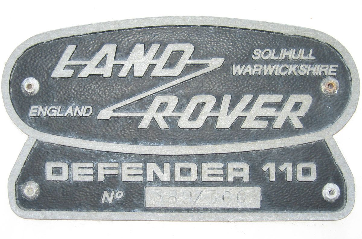
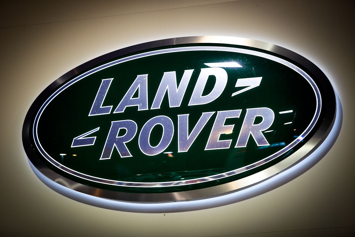
Before the green logo in 1989, the first one, designed in 1948, looked like a pair of dog tags. The 1989 logo became oval and featured most of the inscriptions of the original. The Z-shaped line, connecting the words Land and Rover, evolved into small signs that many people believed to reflect the company's motto 'Above and Beyond,' according to Car Logos.
The current logo is oval, green and framed with a white border. Many people believe that the green stands for vitality and reflects the spirit of the brand. The white letters embody dignity and purity. The designers omitted unnecessary wording that the old logo had and placed only the company name on the new logo. I believe that all car logos should contain the company name.
8 Lincoln
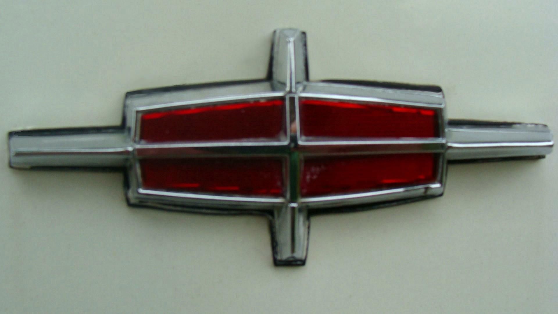
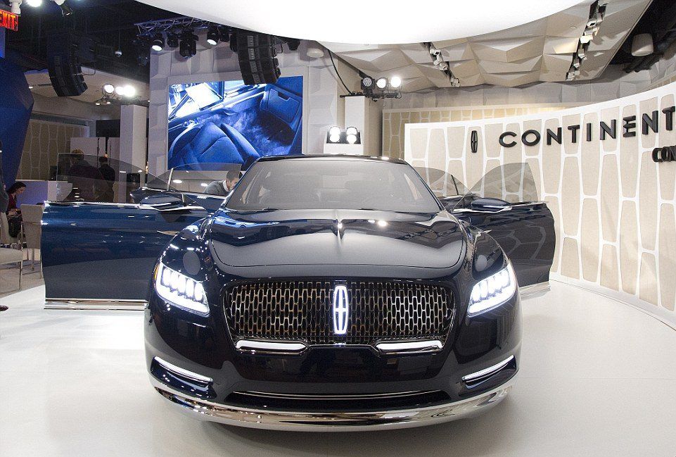
One of the car brands featured on the list that has a simple logo is Lincoln. A Continental star represents that brand, adopted in the late 50s after the merger of the Lincoln and Continental lines. Consumers welcomed the simplicity of the logo, unlike other brands. The logo became a symbol of prestige, luxury, and elegance.
Although the logo changed several times since its debut version, the U.S. manufacturer returned to the design of the star. Although the logo is simple, it doesn't degrade the car's elegance. My only problem with both logos is that it doesn't contain the company's name. Consumers who are new to the market will struggle to determine the brand.
7 Maserati
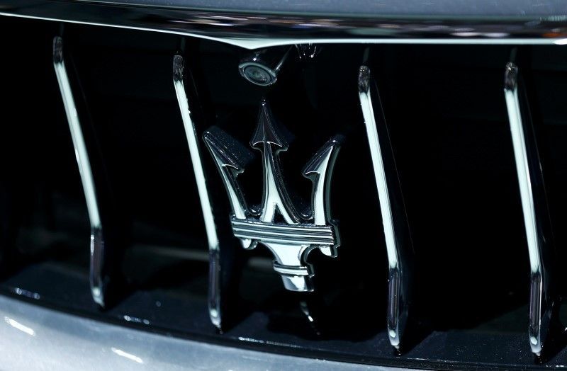
Being a luxury sports car manufacturer in Italy meant that Maserati needed a logo that suited the elegance of its cars. The brand's mission statement is to build ultra-luxury performance automobiles with a timeless style. The trident logo was based on the Fountain of Neptune on Bologna's Piazza Maggiore. Mario Maserati used the logo, considered appropriate due to Neptune representing strength.
The statue is a symbol of the company's original home city. The blue color symbolizes strength and class while the white stands for purity. The logo's format might have changed, but the sign remained the same. The only major change on the new logo is that the Maserati designers opted to omit the word Maserati from the final design.
6 Mazda
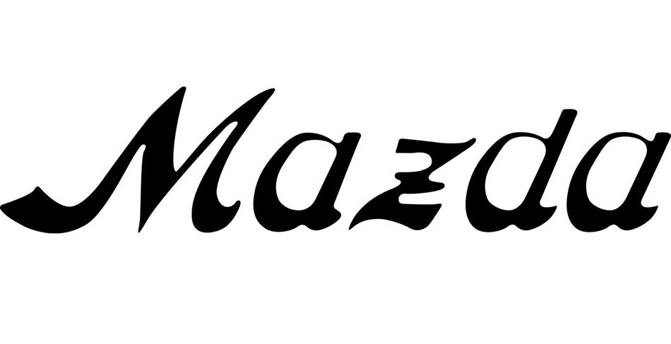
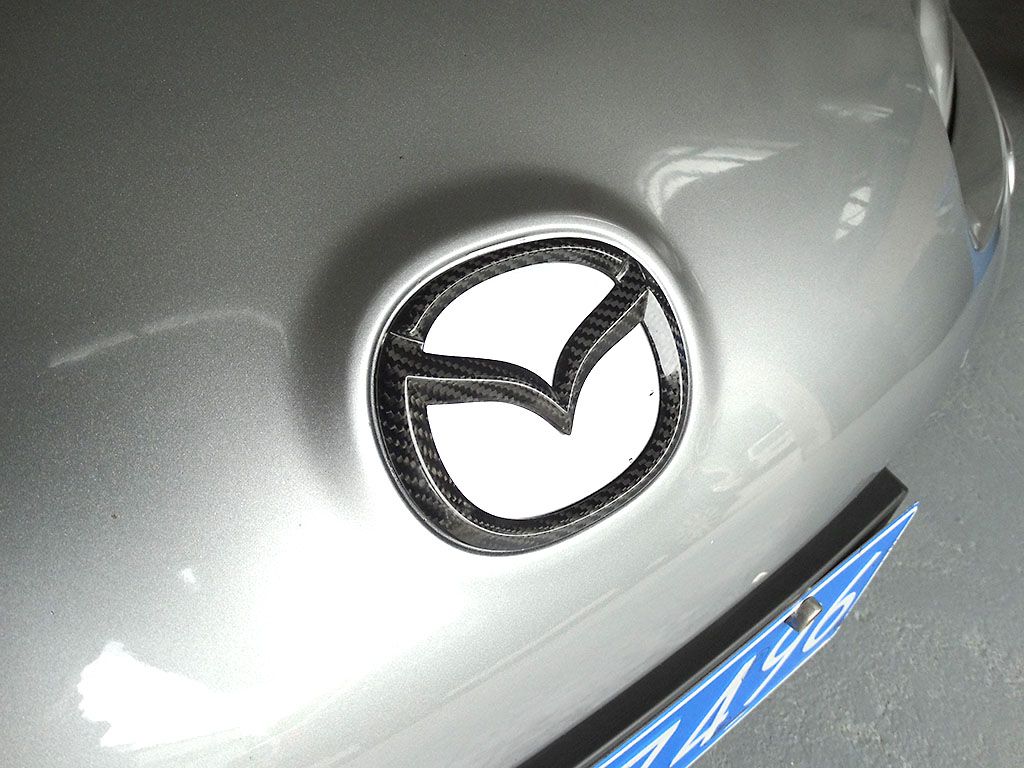
The first Mazda logo appeared on three-wheel trucks in the 1930s, according to Inside Mazda. The foreign manufacturer used a simple approach to write the company's name without fancy symbols. In my opinion, the logo devolved when Mazda introduced a logo in 1936 that represented the river flow of Mazda's hometown, Hiroshima.
All the letters in the new logo are in lower case except for D. Letter D in lowercase protruded from the upper line, prompting the decision to use the capital D to make the corporate mark fit into a rectangle. The new sign represents the brand's evolution toward higher quality and sophistication.
5 McLaren
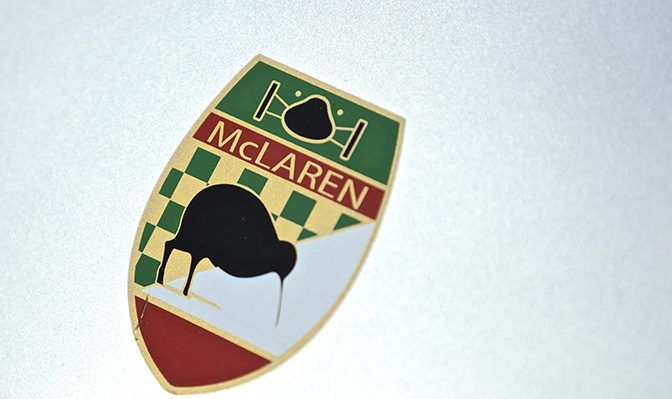
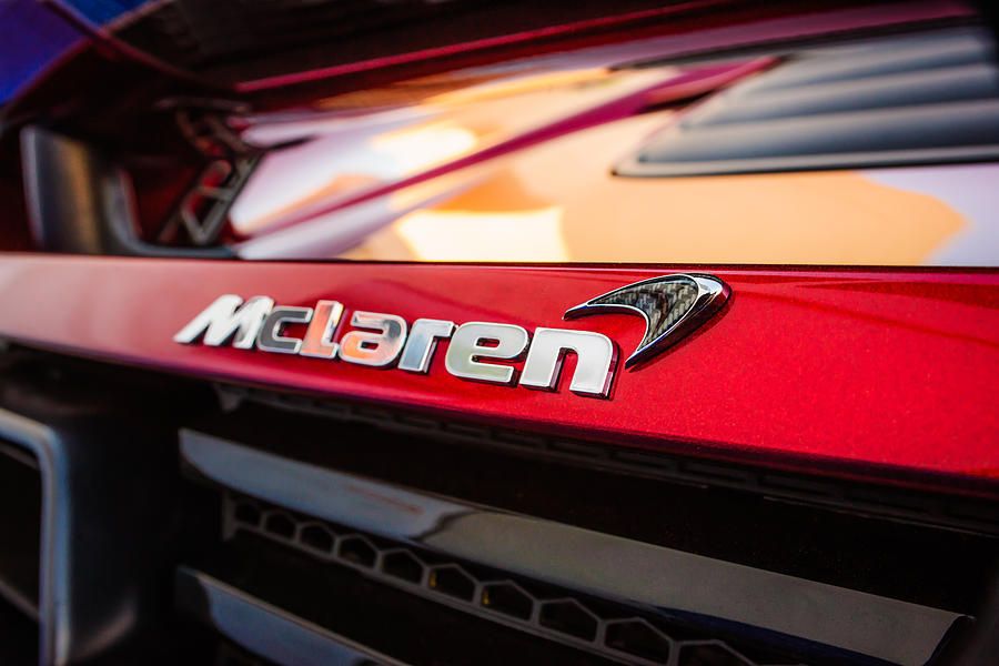
McLaren employees will say that the 'speedmark' logo inspired the vortices created by the car's rear wing. According to Road and Track, the origins of the logo is traced back to the outdated sponsorships and a flightless bird. When native New Zealander Bruce McLaren ran the team, the car wore a badge featuring a Kiwi to honor the boss' home country.
The logo changed in 1967 to the more stylized Speedy Kiwi. The two aspects that inspired the 'speedmark' were the Marlboro chevron and the Speedy Kiwi. The new logo is more elegant than the tobacco one with the flightless bird. Opting for only the letters, instead of featuring the bird, the designers matched the car's logo to its sophisticated design.
4 Mercedes
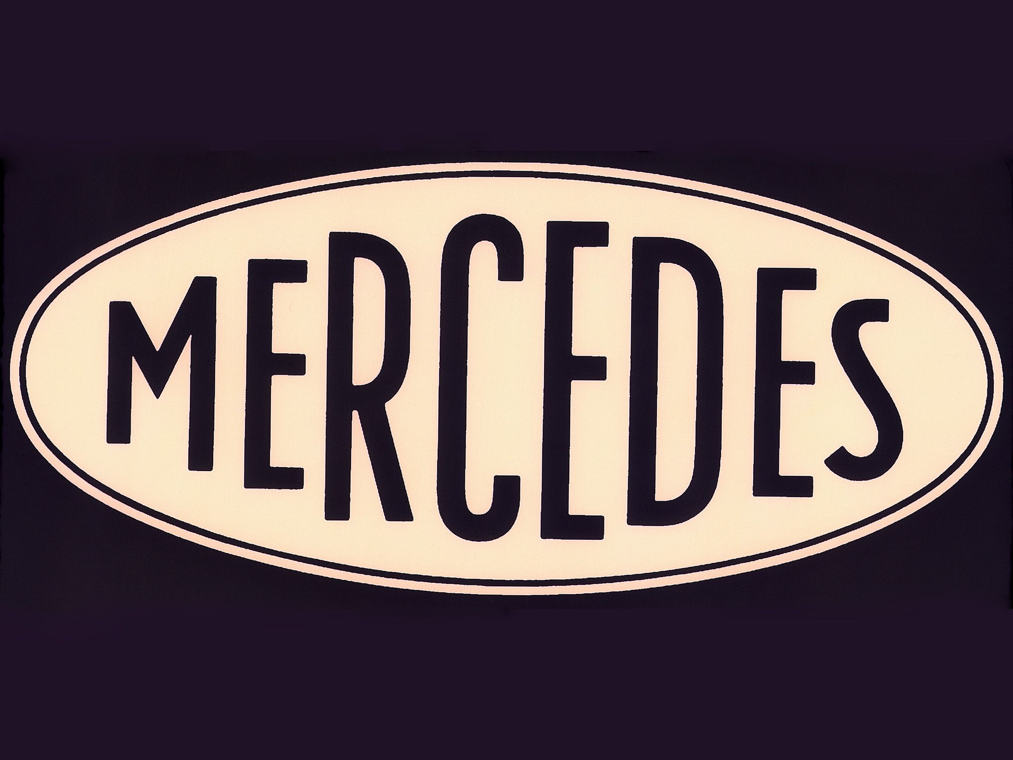
The original logo debuted in 1902 and featured the brand's name, Mercedes. Although the logo depicted the company's name, consumers didn't associate the logo with the elegance of the car's design. The automaker used silver in the logo due to the brand's involvement in the first Grand Prix at the Nürburgring in 1934. The car exceeded the eligible weight of 1653 pounds, so the officials spent the night polishing off the white paint to get the car back to its silver color.
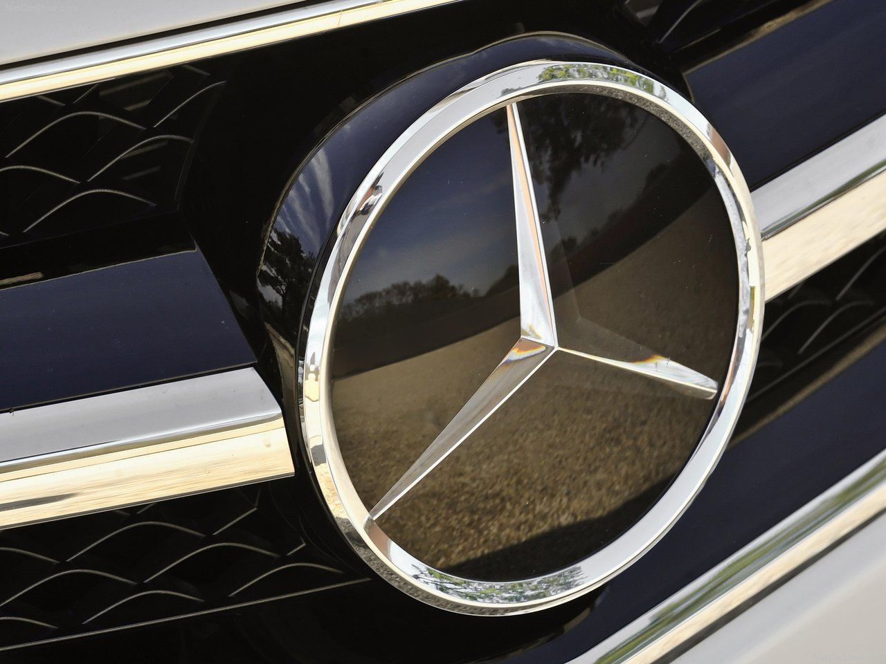
The new Mercedes logo is more sophisticated than the first one that the automaker released. The logo consists of a depiction of a three-pointed star that represents its domination of land, sea, and air. Although the new logo doesn't contain the company's name, Mercedes doesn't need it since it worked hard to garner a reputation for building luxury, performance cars.
3 Porsche
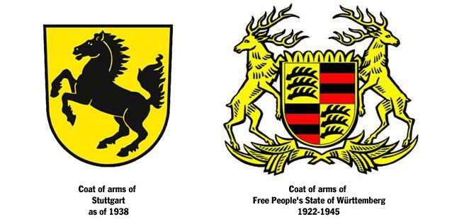
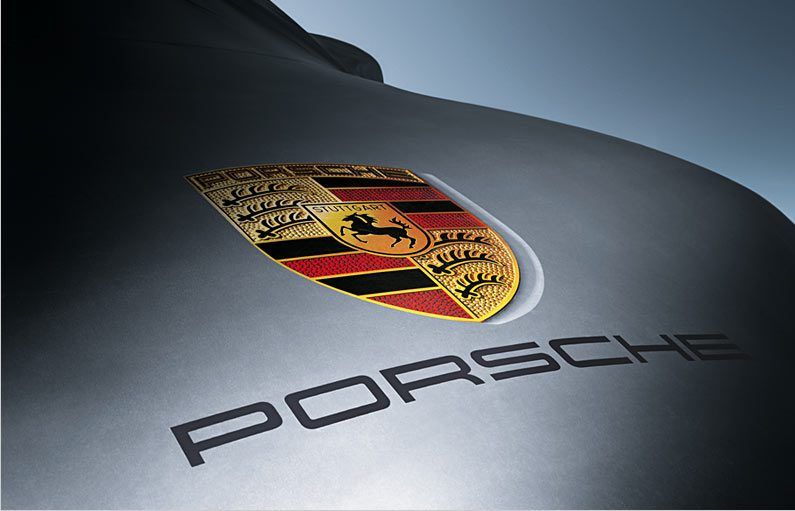
The manufacturer based the original logo on the coat of arms of the Free People's State of Württemberg of former Weimar Germany. During the production in Stuttgart, Porsche placed the Stuttgart coat of arms in the middle as an inescutcheon. Xavier Reimspieb sketched a crest in 1936 that symbolized the roots of the company.
Porsche has continued to use the design of the original logo in the new one with a few minor differences in detail. The new logo contains the word Stuttgart, symbolizing the location where the manufacturer produces the cars. The other change that Porsche made was to combine the coat of arms of Stuttgart and Free People's State of Württemberg into one logo.
2 Volkswagen
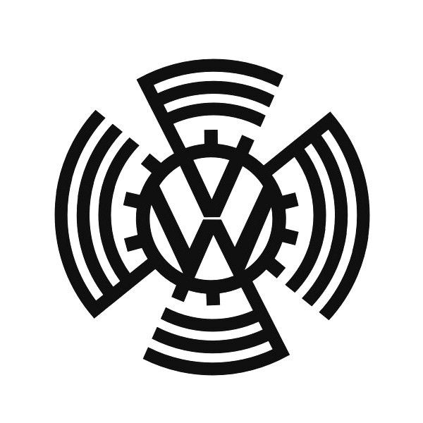
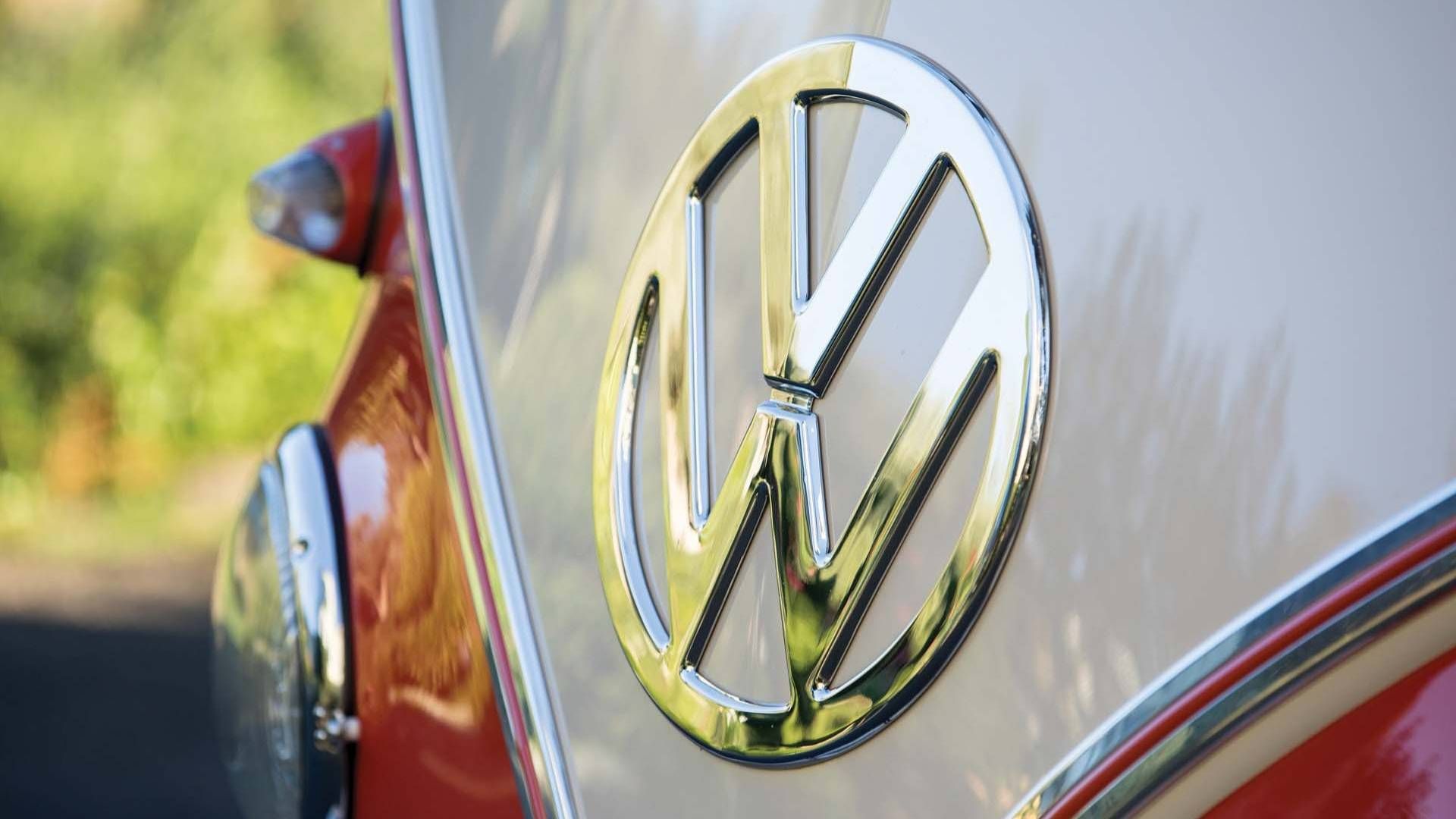
The first logo that Volkswagen introduced was in 1939. The symbol signified an ancient Nordic symbol called Ginfaxi, a binding in ancient rune that granted victory in any battles. The original logo represented a political era that not many people wanted to recollect. For the sake of keeping its market share, Volkswagen redesigned the logo.
The new logo contains two letters: V and W. A circle holds together the two letters of the same line weight. The engineers strived to add the right amount of 'air' in the spaces around the central image not to affect the legibility of the logo. The blue color represents class while the white highlights nobility, charm, and purity. The manufacturer stated that it had plans to alter the current logo.
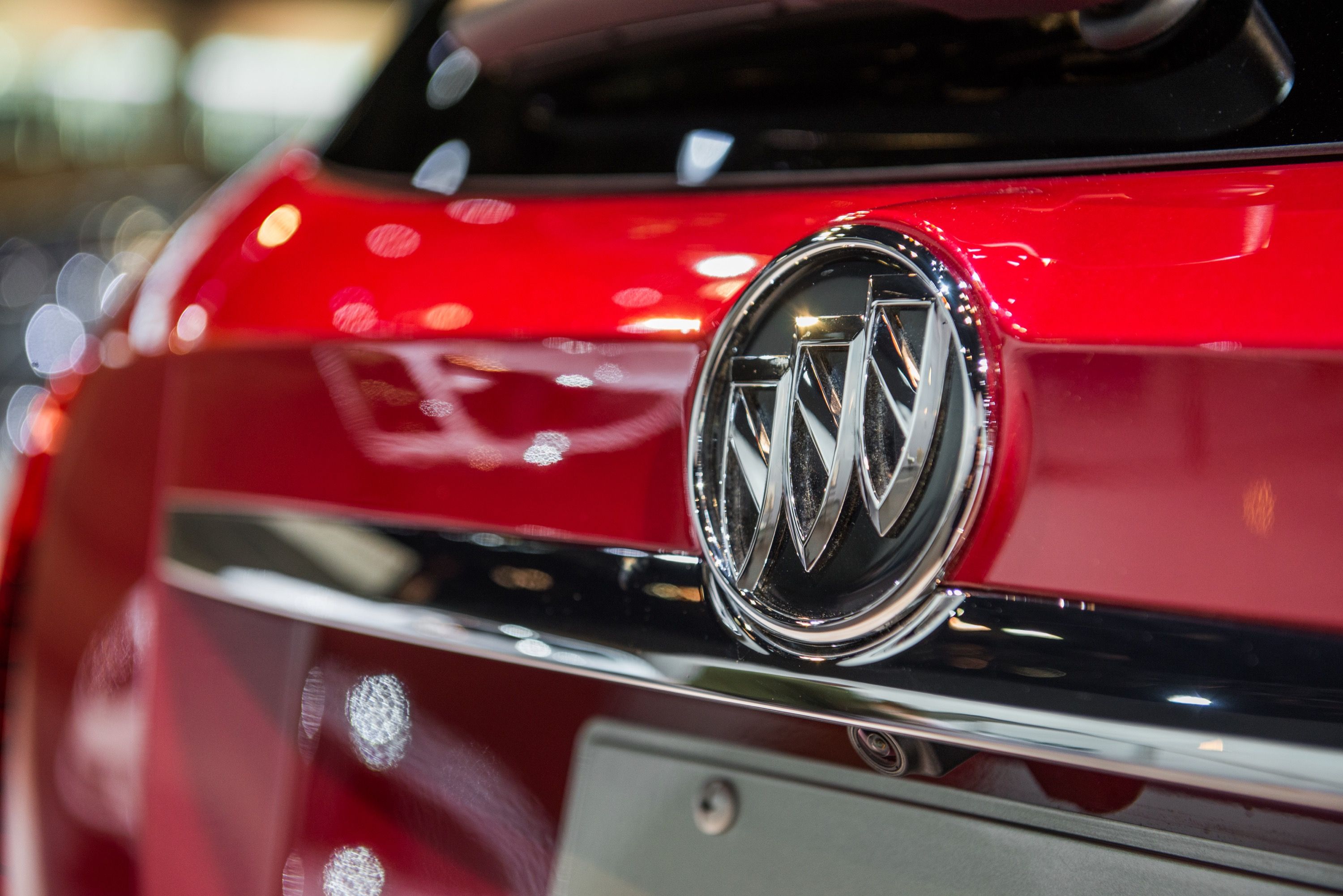
1 Buick
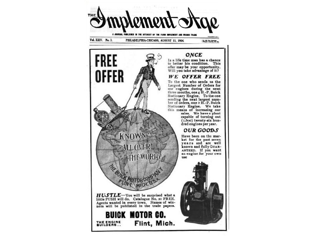
The founder of Buick was Scotsman David Dunbar Buick. The company has undergone several logo changes. According to Car Logos, the first logo that Buick used was in cursive and brass colors. The logo was located on the radiator grills. The company adjusted the logo several times but retained the Buick name in every design.
Buick mixed the colors and attempted to make the logo presentable in an abstract manner. The U.S. automaker started using three shields after a researcher discovered the ancestral arms of the Scottish family. The automaker used the shields to pay homage by incorporating the ancestral arms. The new logo maintained the shields but didn't contain the color.
Sources - New York Daily News, Car Logos, Road and Track & Daily Mail

