General Motors pulled the plug on the Pontiac brand in April 2009, thereby ending one of the best-selling car brands in America. Before that time, though, Pontiac was responsible for some of the most ferocious cars ever made and played a significant role in shaping the American muscle car era. Pontiac's first logo appeared back when the company was known as Oakland Motor Company.
The crest was shiny and extended vertically within a broad silver border, with its body separated diagonally by a white banner bearing the black "Oakland" writing. The red and black stripes at the top and the blue and black stripes at the bottom were further delineated by the black "Oakland" lettering.
Iconic in its own right, the Pontiac logo exemplifies how a company's roots may be represented in a way that looks forward to the future. Even towards the end, the company never strayed from its original mission and values. Every car logo has a story behind it, so let's look into the history of Pontiac to find out where the logo came from.
In 1907, Pontiac Introduced Their First Logo
Pontiac had its time in the spotlight, but those days are long gone. Since 1907, when the Oakland Motor Car Company (later the Pontiac division of GM) opened its doors, its logo has changed many times. In 1893, Albert G. North and Harry G. Hamilton established the Pontiac Buggy Company in the Oakland County town of Pontiac, Michigan.
In 1906, the company shifted its focus from horse-drawn carriages to automobiles, changing its name to Oakland Motor Car Company. Their first automobile, branded with the Pontiac name, hit the roads in 1926, and they officially joined the General Motors family in 1909. Therefore, Pontiac received a new badge in 1926. This time, it was a representation of the company's name, which pays homage to the Native American tribe. A broad banner with the white uppercase logotype extended over the picture was attached to the triangular dark-red crest, which also included a Native American man's profile in white.
Again in 1930, Pontiac updated its emblem. A white Native American guy with his head turned to the right was now flatly colored, and he was placed on a solid black circle with the word "Pontiac" written in strong italics above him. The black and white double outlines encased the roundel, giving the emblem a sense of airiness. The last time we saw a Native American head design was in 1956. The traditional Native American profile was swapped out for a more modern and refined symbol—a red arrowhead pointing downward, or "Dart"—in an effort to attract younger buyers interested in reasonably priced performance automobiles.
1959 saw the debut of a simple geometric logo. The 1959 wide track edition of the Pontiac Bonneville was the first to use the new logo. It had a bright red backdrop, a black and white border, and a strong triangular crest with neat lines. Moreover, the logo featured a white four-pointed star with extended horizontal rays. In this case, the star is superimposed over a so-called "Ted" backdrop.
The Foundation For The Renowned Pontiac Logo Was Set In 2002
With the addition of a huge gradient-silver border around the red crest in 2002, the Pontiac logo took on a more three-dimensional appearance. The logo's body was darkened and given more depth by the frame's shadow. The star was still there. However, it had been redrawn in a sparer fashion and shrunk in order to fit inside the badge's new frame.
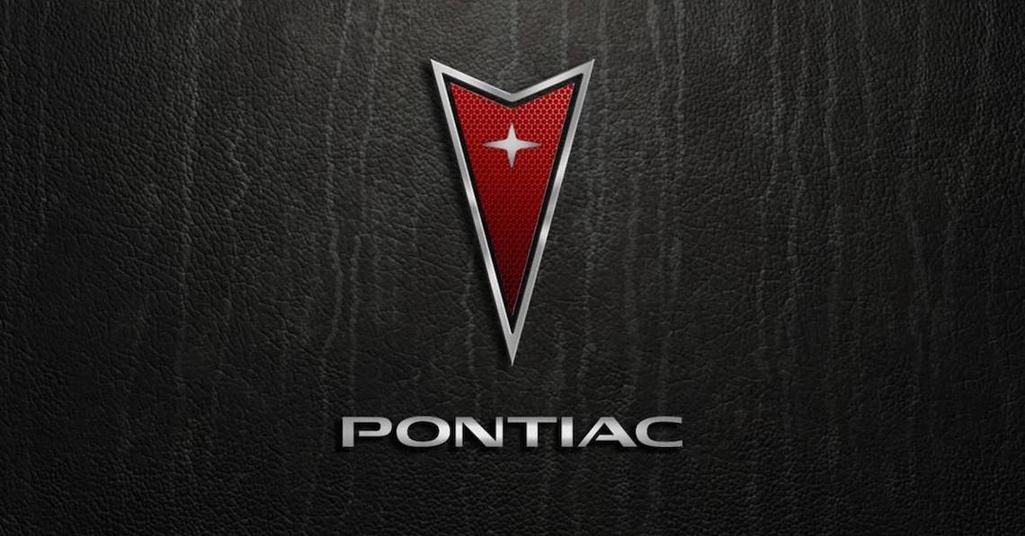
The last Pontiac logo was designed in 2004 and used until the brand quit in 2010. The logo's outline shrank and became a silvery sheen; the crest's body did the same thing, but the red was now toned down. Silver had replaced the gold in the star's setting. In strong capital letters in gray, the Pontiac crest was joined by the "Pontiac" writing.
There is no official interpretation of the star beyond honoring the Star Chief, although many people see it as a reference to Native American art and culture. The company's arrow-shaped logo served from 1959 until the company went out of business in 2010. Pontiac intended to appeal to a younger audience, which is why it ditched the old logo.
The Pontiac logo's strong capital letters are presented in a sans-serif font with sharp lines, while the typeface is very similar to Vast XXL Medium or Doublewide Medium. The company used variations of red and silver, as well as gradients between the two, for their brand's visual identity. Together, they looked incredibly sophisticated and classic, conveying a feeling of trust and stability while also showcasing the company's dedication to its core principles and the satisfaction of its clientele.