Porsche is known for many things such as extraordinary cars, a unique heritage, craftsmanship, championship and race wins, and great customer service. This is a German brand with a strong cult following, which is so universally loved that even people who rarely care about cars are its fans. As for the real Porsche enthusiasts, they build engaged brand communities where they exchange information about their favorite models and discuss Porsche-related topics. So, if you are a true Porsche devotee, you probably know the brand was featured in several iconic movies, like Risky Business, Scarface, Gone in 60 Seconds, and No Man’s Land. Perhaps you also know the history of the brand and Ferdinand Porsche’s background and personal life choices. But do you also know the hidden meaning behind the company's logo?
Logos make brands instantly recognizable, and they help sell products and services. And yet not all companies achieve positive brand association thanks to their design symbols. In fact, some logos were a complete fail, while others had a positive association, but customers started seeing them in a different light after a certain scandal or controversy. Even worse, several brands, which enjoyed a positive brand association, decided to redesign their logos and make them more appealing to younger demographics, but failed miserably. Take, for example, the new Kia logo. Although the South Korean automotive company had the best intentions, consumers didn’t warm up to the new design, and various sources reported that the brand's loyalists thought the logo was "confusing." Luckily, Porsche doesn’t have this issue. Not only that, but the German luxury automotive company has an instantly recognizable logo that has remained iconic through the years.
Origins Of The Porsche Logo
Even today, there are conflicting accounts about the creation and origins of the Porsche logo, but this only creates an air of mystery around the brand, engaging fans and customers even more. In a world in which the media constantly bombards consumers with information and data, leading brands use mystery as a marketing strategy. One of these brands is Porsche. The German automotive company has boosted loyalty and built a cult following, more thanks to the mystery surrounding the brand and its emblem.
Although we can’t pinpoint precisely the origin of the Porsche logo, many believe that it was Ferdinand Porsche’s son, Ferry, the brilliant mind who imagined the logo. Conversely, many Americans are pushing a different narrative, and they argue that Ferry drew the logo on a napkin while having a talk in New York City with American Porsche distributor, Max Hoffman. Meanwhile, the Germans are trying to debunk the story, insisting that the genius behind the design was Austrian engineer, Franz Xaver Reimspieß. Regardless of who came first with the logo's design, the Porsche emblem is today one of the most recognized brand symbols in the world. Even people who say they don't care about European cars know the Porsche logo.
The Porsche Logo: The Symbolism And Its Meaning
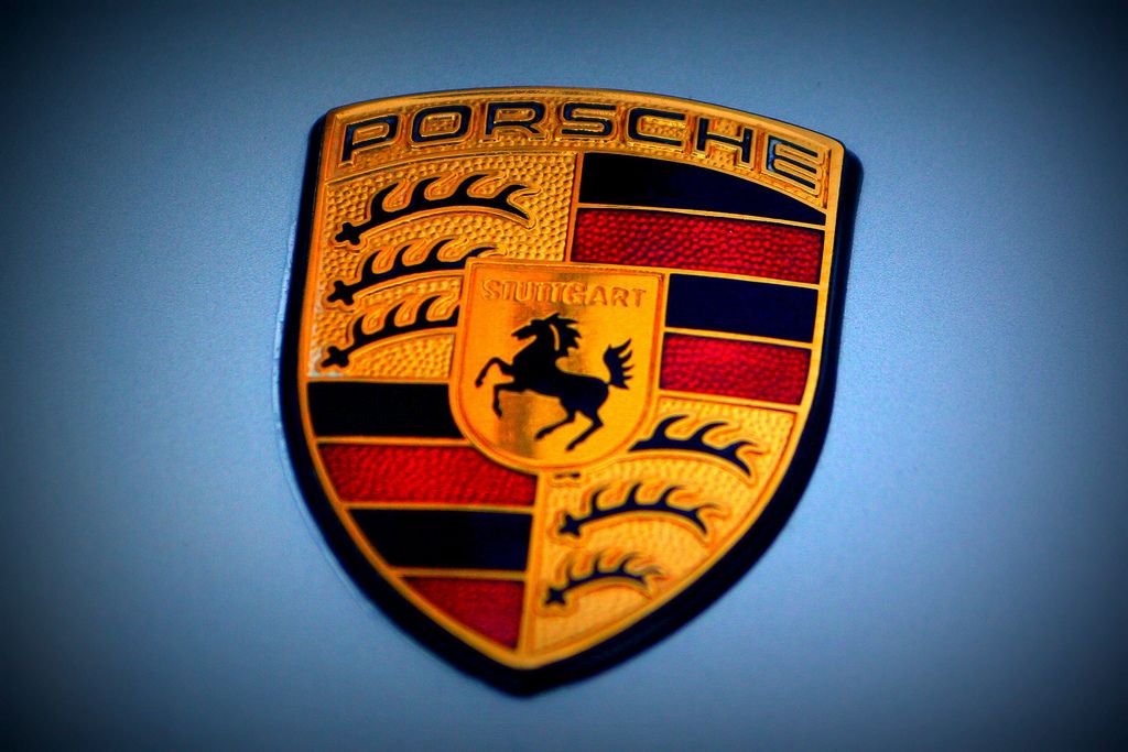
There is quite a lot going on with the Porsche logo. At first sight, it has several elements such as the rearing black horse, black and red stripes, the Porsche name and antlers. Probably, if it wasn’t Porsche, but a less-known label, people wouldn’t be so in love with the emblem. However, being Porsche, everything seems to have worked out fine in the end.
As for the design elements, they all point toward the Free People’s State of Württemberg’s coat of arms. When the logo was released, the German automotive company had its headquarters in Stuttgart, hence, this was an ode to the beautiful location. Meanwhile, the black horse is again a form of acknowledging Stuttgart because the area had horse-breeding farms. It is worth noting that a black horse is also present in the Stuttgart city coat of arms. Meanwhile, the red and black stripes are borrowed from the Württemberg’s state seal. Elsewhere, the word "STUTTGART" shows clearly that this is more of a crest than a coat of arms. Furthermore, it conveys the pride of being part of Stuttgart's legacy and history.
The Porsche Logo: Then And Now
While other emblems changed significantly during the years, the Porsche crest was only slightly upgraded while the design elements remained the same. For tech-savvy younger consumers, this move might appear antiquated, but traditional Porsche buyers love this constancy because it communicates an aesthetic legacy.
With that being said, Porsche has selected to employ some upgrades, such as toning down the red in the stripes, which resembled more of an orange shade, highlighting the Porsche letters by writing them in black instead of gold, and refining the image of the black horse. These hardly-noticeable changes are making the logo even more preeminent and fabulous.


