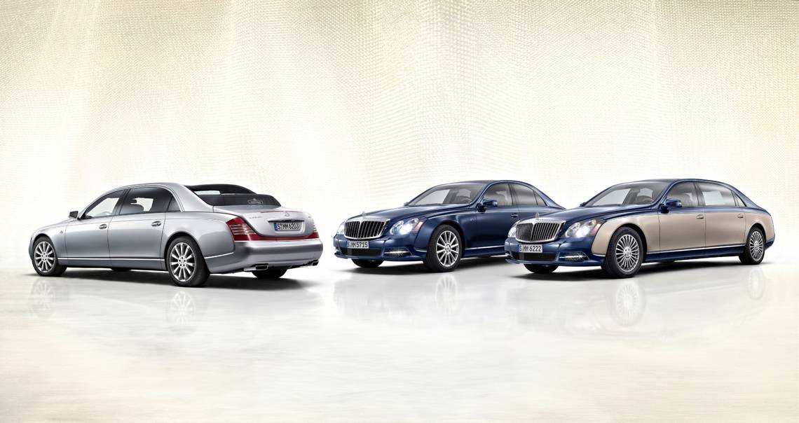
While modern gearheads know Maybach because of its association with Mercedes-Benz, originally, the German company was an independent luxury automaker. Established in 1909 by father-son duo, Wilhelm Maybach and Karl Maybach, as a subsidiary of Luftschiffbau Zeppelin GmbH, the company got its start by assembling diesel and gasoline engines for Zeppelins, and later, it went into the production of rail cars. Fast-forward to the end of World War I and in 1919, the company finally built its first automobile. For the next twenty years, the German firm produced several classic vehicles, but during World War II, it went back to the production of engines. The turn for the better came in 1960 when Daimler-Benz purchased the enterprise. In the past six decades, the company came a long way and now, contemporary gearheads know Mercedes-Maybach for some of the coolest concept cars and prototypes.
Although historians have chronicled the story of this enduring German car manufacturer, the significance of the company's emblem is obscure. Most people agree that the double “M” stands for Maybach Motorenbau, but there’s more to it than meets the eye, and things are not that straightforward. So, keep on reading to find out more about the real meaning behind the Maybach logo.
The History Of The Maybach Logo
While Maybach wasn’t assembling vehicles yet in 1909, it did build diesel and gasoline engines, so the company was already famous and in need of a remarkable emblem that could communicate the engineering prowess of the firm. Accordingly, the father-son duo debuted the firm’s first logo, which stood out thanks to its minimalist design and geometric pattern.
The original emblem featured two letter “Ms,” enclosed in a triangular medallion with soft corners. In addition, there is also a word mark positioned at the bottom of the triangle. Here, the color palette is the one that attracts the most attention, as the luxury automaker chose to write the letters “M” and the word “MAYBACH” in green with white outlines over a gold background. Interestingly enough, the German car manufacturer decided to keep the same design until 1997. There are only a few brands that can brag they kept the same design elements for such a long period, but Maybach didn’t keep only the symbols unaltered, but also the entire emblem. Naturally, this conveys consistency and loyalty. Additionally, it makes the company appear more credible, timeless, and predictable, which in turn, promotes client loyalty and trust.
Maybach unveiled a new logo in 1997, however, with minor modifications. The new logo eliminated the white frame that circled the triangle and made the emblem look three-dimensional. This time, the two letter “Ms,” were in black and so was the frame of the triangle, which previously was white. A cool feature is the silver outline around the letters. Maybach, though, kept the golden background, which worked very well with the black letters. Important to note that graphic designers have eliminated the word “MAYBACH” from this emblem.
This Is What The Color Selection In The Maybach Logo Conveys

As a general rule, car logos use rather toned down, traditional hues. This is mostly because automakers want to appeal to a wider audience. For instance, while younger consumers love intense, fiery colors, which convey strong emotions and feelings, older buyers prefer more traditional shades, which evoke a feeling of calm and serenity. However, some automakers have selected to take risks and experiment with bold colors. The Ferrari logo, for example, features the black prancing horse on a canary-yellow background. Additionally, the shield includes three bands of color at the top: green, white and red, the colors of the Italian flag. Meanwhile, Fiat and Bugatti employ an intensely red background for their emblems. And Alfa Romeo uses a split design with two symbols that are in the red and green. It goes without saying that some automakers do not experience chromophobia or fear bright colors.
Maybach belongs in the group of risk-taking car brands, as it uses vivid, unusual colors for its emblem design. This choice works well with the company’s vehicles, known for their bold styling and eye-catching features. Take, for example, Virgil Abloh's Project Maybach, that appeared in Drake’s music video. Maybach didn’t design this vehicle, with its “over-inflated proportions” and external pool cage, for the average person, but for risk-takers who are not afraid to smash down barriers.
Without a doubt, Maybach’s logo exudes audacity, joy, and confidence. Mercedes-Benz could take a page from Maybach’s playbook and adopt a more daring approach to its design decisions and styling elements. Let’s not forget that the company’s silver three-pointed star uses a rather timid and unadventurous style and hue.
Sources: Ferrari Lake Forest and 1000 Logos.