If a brand can be described as the quintessence of automotive elegance, it has to be Rolls-Royce. For decades, the luxury automaker has been associated with the British royal family, Maharajas, aristocrats, and the global elites. And for decades, it's been a symbol of extreme wealth, success, and prestige.
Rolls-Royce is in a class of its own. It exists in an opulent world populated by beautiful, carefree, and extremely wealthy people; thus, every feature of the brand has to be distinctive and timeless, attributes of the people who make up the brand's target market.
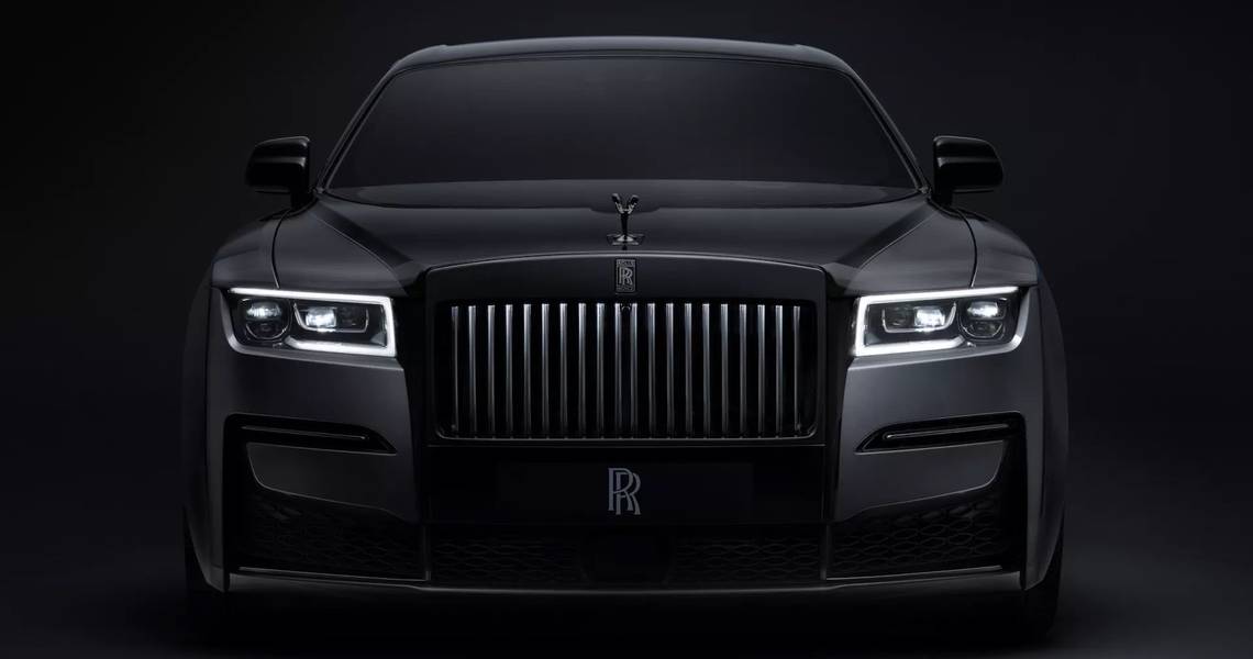
For instance, the “Spirit of Ecstasy,” or the bonnet ornament sculpture that represents the figurine of a woman in flowing clothing has become almost as legendary as the Rolls-Royce brand itself. Not only that, but gearheads have become obsessed with finding the story behind the ornament. However, it's not only the ornament that fascinates fans, so read on to learn about the company’s emblem and the real meaning of the Rolls-Royce logo.
The History Of The Rolls-Royce Logo
Simply put, the Rolls-Royce emblem went through some major changes during its long history. First, Rolls-Royce debuted the original emblem in 1906. This logo had several symbols that were part of an elaborate coat of arms. The automaker added the Rolls-Royce icon and a lioness on the top half, and a seahorse, and wings to the lower side.
These images undoubtedly convey freedom, courage, power and independence. Second, the automaker selected the color red for the initial insignia because it was a very popular hue at the time. In 1911, Rolls-Royce came out with an emblem, which replaced the four sections (the Rolls-Royce symbol, lioness, seahorse and wings) with heraldic lions. The upper part of this emblem included wings, while the lower part a flower and a ribbon with the words “The Best Car In The World” written on it. The centerpiece of the new emblem is a vertically printed rectangle that includes a double “R” and the Rolls-Royce monogram.
In the same year, the British automaker released another logo, which included the letters “RR” written in custom serif font and positioned inside an Art Déco oval and frame. The company used this emblem until 1973 in parallel with other logos. Depending on the viewpoint, 1911 appears to have been either a very creative or a very ambiguous year for the British luxury automaker. Rolls-Royce released a third emblem that was used until 2020. The third logo featured the “Flying lady,” which depicts a woman leaning forward with her dress flowing backwards. This figurine served as the company mascot and has come to represent the brand.
After the release, Rolls-Royce positioned Charles Sykes’ beautiful statuette not only on the car’s hood but also inside the logo. Today, the iconic Spirit of Ecstasy, “is the most famous and desirable automotive mascot in the world,” says Torsten Müller-Ötvös, the CEO of Rolls-Royce. It is significant to note that the statue has been re-sculptured since its debut to improve the car’s aerodynamics. Rolls-Royce says they needed 830 hours to create the final, hood-mounted masterpiece.
Between 1973 and 1998, Rolls-Royce used a minimalist emblem, which included the letters “RR” written in white typefaces over a blue background and enclosed in a rectangle with soft corners. The letters looked two-dimensional and very modern. In the 90s, the automaker kept the same minimalist aesthetic, but the font was black, and it wrote the letters on a silver background. There aren’t major changes between this emblem and the one used until that date. The latest emblem includes only the letters “RR,” which are no longer written inside a rectangle.
The Selection Of Colors In The Rolls-Royce Logo

As a luxury brand, Rolls-Royce is obsessed with figuring out every minor style detail. This means the company doesn’t want to experiment with colors and fonts too much. In fact, Rolls-Royce restricted the number of hues that its graphics and design departments use. During its long history, the company has selected only the colors: white, black, blue and silver.
These dominant colors complement each other brilliantly and their contrast communicates elegantly the company’s brand identity. Moving forward, Rolls-Royce will probably continue on the same path, without altering the course too much because as a luxury brand, it craves stability and continuity.
Source: Rolls-Royce, Popular Science