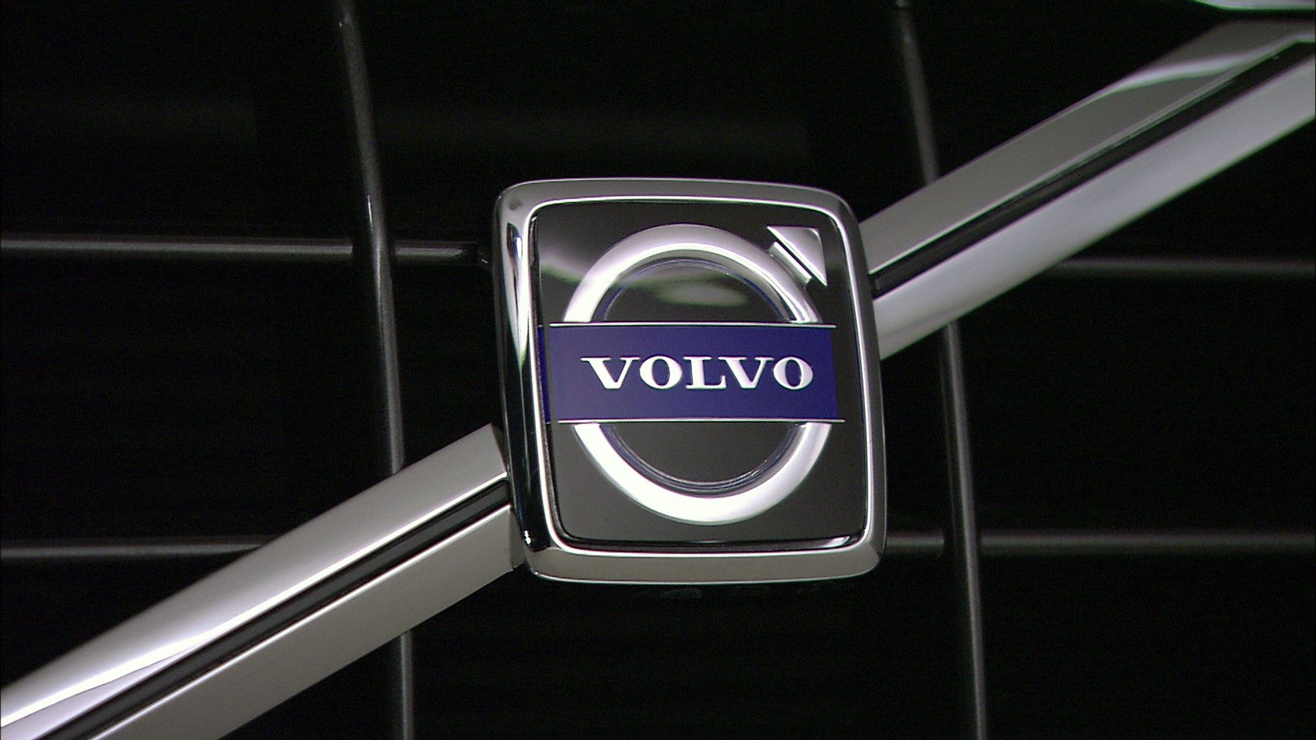
If there’s one thing that most people know about Volvos, apart from that they used to be boxy-looking and were most likely to be the cars that your grandparents drove, it’s that Volvos are safe. Is that perhaps why the Volvo logo looks like the symbol for the male gender?
Well, not quite. The Volvo logo isn’t just the symbol for the male gender. The circle and diagonal arrow symbol was actually the alchemic symbol for iron, chosen to honor Volvo’s humble beginnings — and not even as a maker of cars! The funny part is that the first ever Volvo logo looked nothing like the logo we all know of today.
Keep reading to see how the Volvo logo evolved, and how it ties into the evolution of the Swedish brand renowned for its outstanding commitment to safety.
The Origins Of Volvo
"I roll". Those aren’t the questionable lyrics to a new Wiz Khalifa song! It’s the meaning behind Volvo... literally. Derived from the Latin verb ‘volvere’ meaning 'to roll’, ‘volvo’ is the first-person singular form, quite simply meaning ‘I roll’.
Volvo actually started out in 1915 as a maker of ball bearings — for everything from machinery, and transmissions, to bicycles — before shutting shop in the early 1920s. It was owned by a larger company, SKF, which continues to make bearings today. They came up with the name Volvo because it was easily pronounced, easily remembered and perfectly fit what the company did.
When founders Assar Gabrielsson and Gustaf Larson (an engineer with SKF at the time) came up with the idea to make safer cars for Sweden in 1926, over dinner no less, SKF allowed them to resurrect the Volvo name. For the founders of Volvo, the idea was as simple as recognizing that no car manufacturer was making cars as safe as they thought cars should be. So they decided to build a safe car themselves.
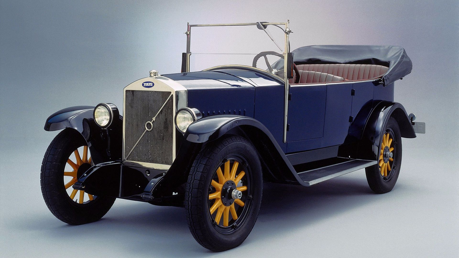
The first Volvo car was the ÖV4, or Open Vehicle 4-cylinder, also known as 'Jakob'. Interestingly, the first-ever Volvo logo was merely the name of the company with Gothenburg, Sweden written under it, enclosed in an oval. This logo never made it to any of their cars though, with the ÖV4 fitted with the now-famous Volvo Iron Mark logo.
What The Volvo Logo Means
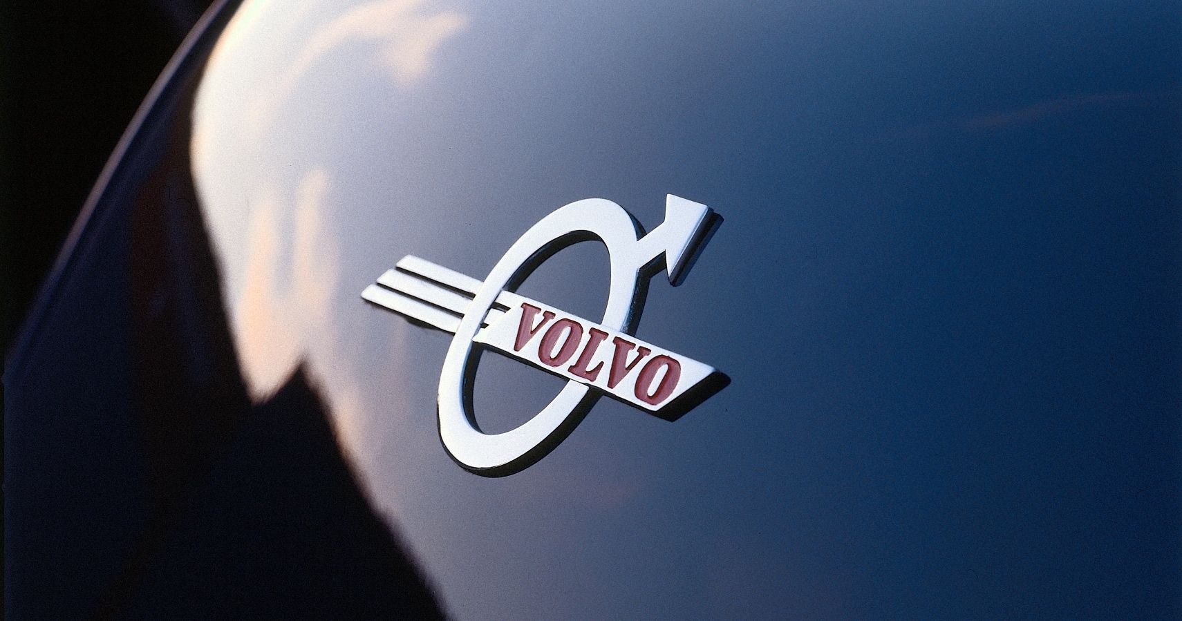
It can also be said that the logo could be seen as a ball bearing with an arrow, in reference to the company’s roots. Going back in history though, the circular symbol with the diagonal arrow first stood for the planet Mars in the Roman Empire, and consequently the Roman god of warfare, Mars. Because of that connection, the symbol was closely associated with the making of weapons from iron, and over time came to be the symbol of iron industries worldwide. That was probably why the symbol was chosen as the new logo for Volvo, which was the first logo to be placed on its cars. The Iron Mark symbol can now be seen as one that forms associations with the strength and safety offered by steel.
Which, of course, ties in perfectly again with the founders vision of safety being one of its basic principles. It’s what drove Volvo to pioneer the first automotive laminated windshield in 1944, the first safety belt system in 1959, shock absorbing bumpers in 1974, ABS in 1984, side impact airbags in 1994 and more!
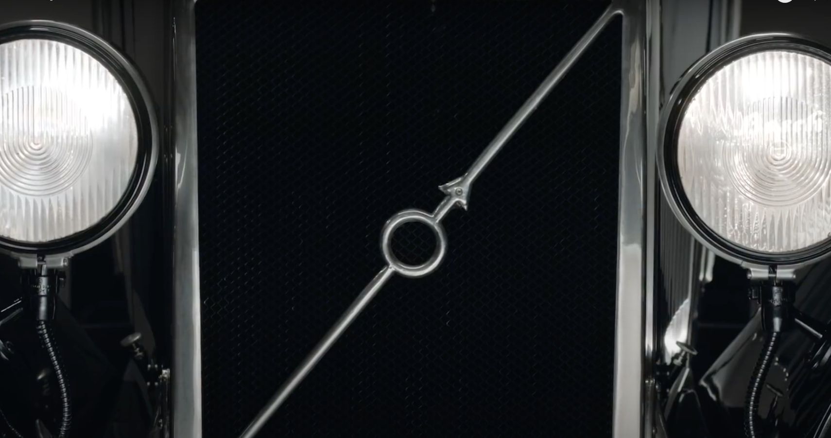
Interestingly, the Iron Mark logotype on the ÖV4 and the chrome strip running diagonally across the grille, was there to actually support the logo on the radiator grille. Long after the functional support element was unnecessary, it continued as a design element. Though, considering the chrome strip also points out the location of the hood release latch, it could be argued it’s still as functional as ever!
Evolution Of The Iron Mark
From the basic logo used from Volvo’s inception to a couple of years down, the official logo became the Iron mark logotype that was incorporated on its early cars. It also incorporated the Volvo name on a banner. This logo was used for just under three decades.
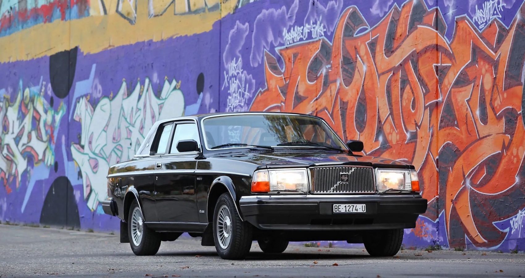
In 1959, the logo switched to a plain wordmark of the Volvo name in a serif font. Alongside, an updated logotype was introduced which simply placed the Volvo wordmark inside the Iron Mark. This, of course, was the logo placed on grilles, steering wheels, interior trim and more.
In 1999, the logo was refined again to reflect a more 3D look, with color choices now incorporating silver and a deeper blue. This logo was then further updated in 2013-14 to a richer chrome silver, with a smaller banner for the Volvo wordmark.
In 2020, the Volvo logo has seemingly come full circle. It’s back to a minimalist wordtype, now placed across the rear of all Volvo cars instead of the logotype. Still, the logotype itself was updated in 2021 to a flat design that harks back to the original. This time, it does a great job to highlight the quiet sophistication that’s built into all Volvos, and we’ll see it on new cars next year. What do we see the Volvo logo evolving to next? It’s anyone’s guess really.

