Bayerische Motoren Werke or Bavarian Motor Works or simply BMW finds its roots in an aircraft engine manufacturer Rapp Motorenwerke which was renamed to the brand name we all know today. This is perhaps one of the reasons why some people expect the BMW logo to be a propeller. (There's actually a good reason why - more on that later). But as it turns out, the evolution of the BMW logo actually begins with absolutely nothing. The first advert that BMW ever had done did not have a symbol or logo that denoted the brand at all.
In its initial days, the company did not really have 'customers' to impress and attract. The main business was the production and maintenance of aircraft engines for the German Air Force. From no logo to a logo called the 'BMW roundel' we all grew up seeing and now a logo that's lost the traditional black ring, here's a run down on BMW's logo over the past century and its evolution.
The Origin Story Of The BMW Logo
BMW started life as Rapp Motorenwerke in 1913 as a manufacturer of aircraft engines, until the company was renamed in July 1917. This was also the year when the first edition of the white and blue logo was drawn out.
Today, BMW's main business is cars. Motorcycles are also something they do, however, it was motorcycles that brought BMW to the mass automobile market with the thinly-framed modern motorcycle R32 in 1923. The car that began BMW's chapter on cars was the manufacturing of a licensed copy of the Austin Seven (that later went by the name Austin Mini) in 1928. The first car to wear the logo was the rebranded Dixi called the BMW 3/15. With this began a career of sports cars and larger luxury cars throughout the 1930s.
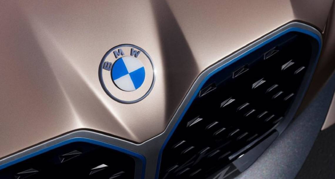
Bavarian Colors On The BMW Logo, But Inverse
It was on 5th October 1917 when the brand got a company logo and the first roundel was registered with the German Imperial Register of Trademarks. The badge kept Rapp's round shape and the black ring. The white outlines were replaced with golden ones, bearing the letters 'BMW'.
The colors within the badge represented BMW's home State of Bavaria. The four quarters of the inner circle have the state colors - white and blue. But they're in the inverse order since the local trademark law at the time forbade the use of any state coat of arms on anything commercial.
So, the logo does not have a propeller in it. It's not just BMW's origin as an aircraft engine maker that gave rise to this belief. Years after the company's first logo was unveiled, an advert showed a BMW logo on the rotating propeller of an airplane. We can't blame the people who saw the ad and exclaimed: "That's what it is!"
Later on in 1942, the company chose to link itself to the propeller theory. An article published in a BMW publication backed the story of the spinning propeller, and it also featured a photo of the BMW logo on a rotating propeller.
BMW Logo Evolution - 1930s To Now
After the company's car business successfully took off, the logo was updated in 1933 with bolder letters and golden lines. This logo was retained for two decades before being changed substantially in 1953 and was now in fact much closer to what we've been used to seeing with white lines on the black ring and white letters as well.
The 1953 logo was updated yet again in 1963 and was the last 2D logo. This was followed by the company's 3D logo in 1997 and has been kept since. In July 2020, BMW rolled out a new communication logo and brand identity that went back to a 2D nature. Not just that, it is now flatter, much simpler, and does not have the traditional black ring anymore.
2020 BMW Logo
The 2020 logo is rather transparent. The company says it is meant to speak to the customers of the digital age. "The new communication logo radiates openness and clarity," explains Jens Thiemer, Senior Vice President of Customer & Brand BMW.
The pared-down and two-dimensional design conveys openness and clarity, says BMW also underlining that 'the change reflects BMW’s transition from centering purely on the automotive world to being about technology and connections.'
The new logo was seen on the BMW i4 Concept, but BMW clarified that the new logo will not be used on cars. It is primarily for the purpose of communication, online and offline. After all, it was a concept car that had the logo and concept cars are free to use different badges or logos or design features that the manufacturer does not intend to put into production. Note that the 2022 BMW i4 sedan sports the 3D logo.
The completely transparent logo looks modern and fit for the 'digital era'. The thought of seeing the logo on a BMW car though, may make some people uncomfortable. But to say the least, it does look nice on the i4 Concept. Perhaps BMW's EVs or hybrids would use it, time will tell.